Portfolio 
Glimpse Into Work
Nikhil is a Product Designer and Researcher. He's also worked as an illustrator previously. Below you see an index for the website.
1. Shaping the product at Niro.money
2. The power of learning
from user interviews

3. Design system implementation for app
4. Showcasing implementation of a design system for web
6. Product Design Case Study (⭐️ recommend reading) ↗
5. Organizing an information
heavy website

Introduction to a feature, we worked at Jollee, (as you read this you'll realise what the work was like)

Drashta is a recent mom. She has this feeling that she's missing out on something. While browsing through youtube she comes across a video about nutrition. In the video she also hears that she can start can start solid foods at about 6 months. her baby will be turn 6 months next months, so this piques her interest. so she finishes watching everything about solid foods too.

After some days, she again looks at her youtube, and notices a video titled "using toys for emotional growth". She feels inadequate that she doesn't know anything about this. soon enough more topics like this come up. despite of having this, she feels this fear of missing something important, something that can be covered only if she knew it.However much she reads, or watches, this feeling doesn't go away.

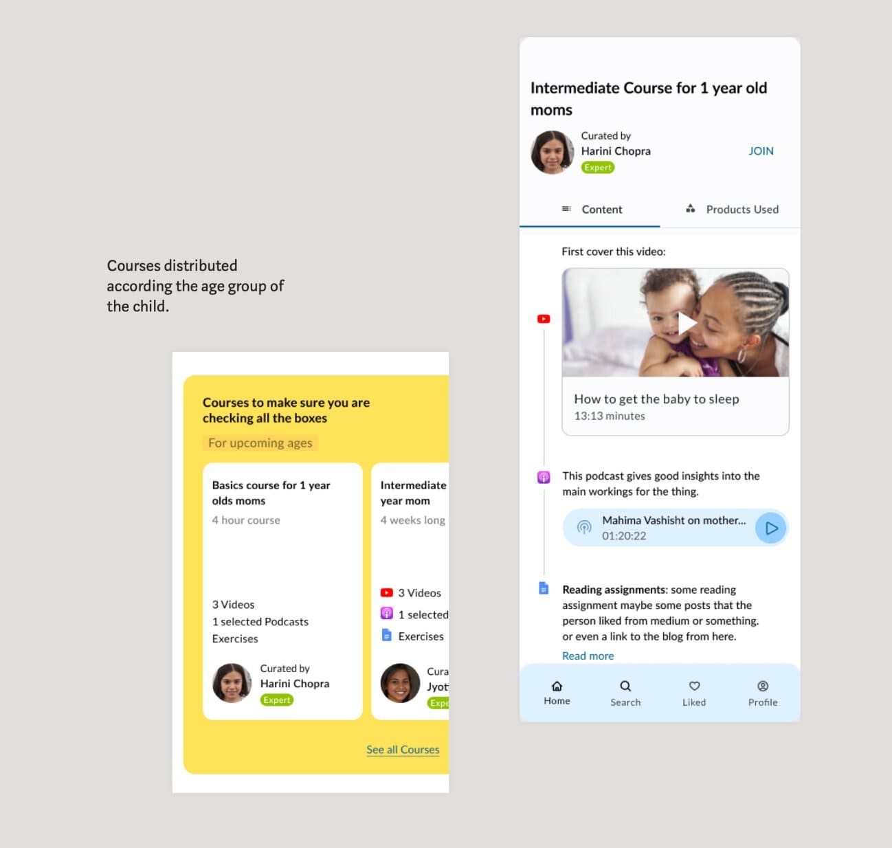
Now she comes across this course (on our website, Jollee),here's what goes in her brain in the next 30 seconds:

  • First thing she notices is the title of the video, the title says "Things I wish I knew before i became a parent"
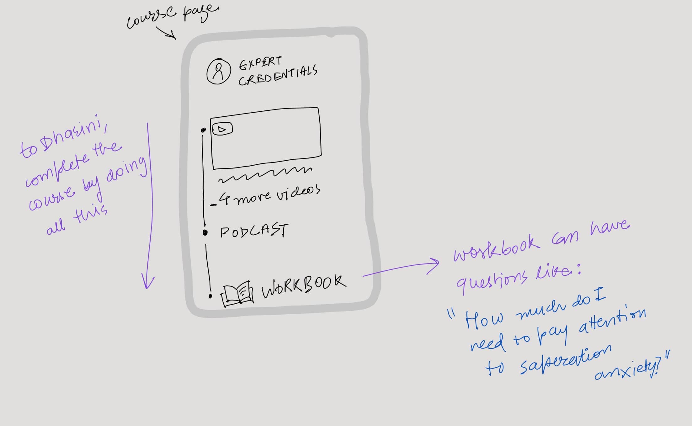
  • Secondly she sees, it's recommended by someone like an expert.
  • She scrolls a little bit, and sees another video, that talks about "15 things to know about parenting."
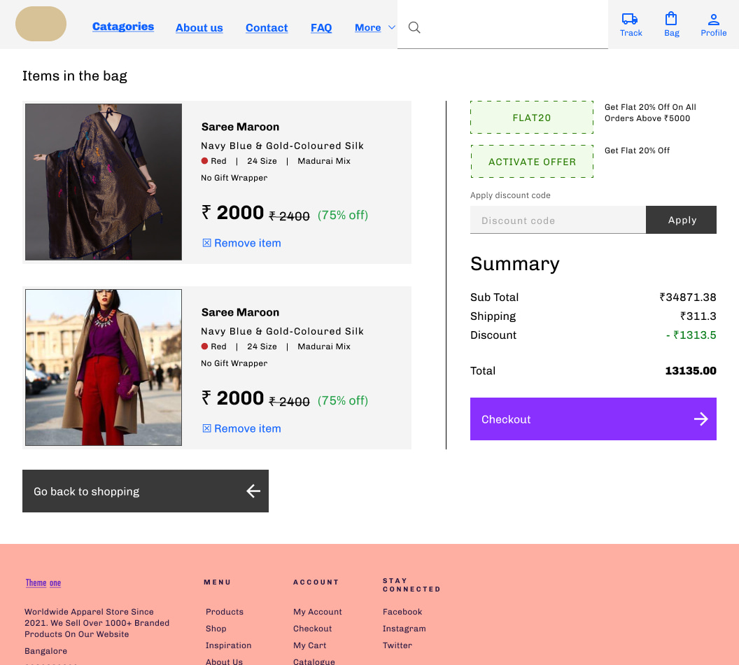
  • She also notices that there's a Workbook section towards the end. the Workbook has a bunch of questions, and she can answer the questions in the app itself.
  • She's easily able to answer most of the questions from the workbook, but there are a few questions she's having trouble with. She gets this feeling to be able to answer all the questions easily. that is something that she looks forward to.
  • In first look, the course appears extensive enough to her. but not unnecessarily long. more importantly, she feels like "If I do this course, I won't have that feeling of looking at every other thing on youtube." thus, even though this looks time-consuming, she decides to start it.

What's this writeup above? this is the end product we wanted, but we are not gonna capable of writing these questions and videos. So, I sent this writeup to a parenting expert and asked them to suggest content, such that the parent scrolling through this, feels all this.


After they made some efforts to think of a course like this, I suggested some guidelines. (I'm essentially asking them to do product design without any experience)


I must highlight the thing that i'm most proud of in this project was the communication to the doctor. Making them come up with product ideas. This required focused listening, sharp communication, and a bunch of enthusiasm, that it gets spilled into them.


finally we ended up with the following experience, with the content that was provided by them.


How have we been shaping up the product at Niro
This is a story of my time at Niro.

Niro is a company which enables its partner companies to provide financial products on their platform.

  1. Financial products like: “personal loans”, “credit lines” etc.
  2. By providing the technology and the experience to make this happen smoothly, but it doesn’t just do the software, it also provides the lending partners.

After launching the PL product we saw that “many people were dropping off without activating their loans (i.e. they were dropping off before confirming their phone number)”. To solve this problem, we approach this from multiple angles:

We approached the problem in three ways: 1, 2, and 3.

  1. Doing the obvious improvements, that are a must. First just trying to fix the problems that we saw in the UI and then talking to users (35 of them). a. Let’s try to fix the problems that we see are the problems, run those initial versions (general improvements, loan amount see immediately, gif the was the wrong metaphor, optimized for smaller phones ): main problems we discovered were: 1. The gift box not really being the right metaphor for “pre-approved loans”, “Optimizing for smaller screens”, “more consistency in the visuals” b. Making guesses around where must they be stuck, looking at their problems (you’ll see what those were below).

  2. Selecting the users and taking to them getting what they were stuck at and making a solution for them. Then talking to the users after implementing the obvious improvements and understanding where they were stuck. We chose the people who showed some interest by going to the “second screen”, multiple times, but never went further. Talked to 35 in total, between me and the APM. Talk to people, learn from the data on mixpanel and improve again. (Experiments) They don’t understand what a preapproved loan is: easy access explainer They don’t have an immediate reason to take the loan.: Timer, coupons New brand, they don’t trust: 2 solutions, RBI logo and a design system that they’ve seen in most trusted products. Telling them more enthusiastically that they’ve got a loan. And that it’s not any ordinary loan. Even after this we just saw an improvement of 5% (between the first screen and the second).

  3. Designing a method to test whether the users who are coming in here, will they be attracted if the interest rate went down. Trying to do some adjustments at the Risk side: — The reason this was done was because we wanted to check if the partners are giving us the right data and customers to us? — So we ran this experiment where we gave out loans at 12 percent instead of 18% as we were giving initially. This is comparable to the competitors in the market, whereas that 18% is more like BNPL and not personal loan. We did this for 2 reasons:

    1. We wanted to check if what we are doing even works at all?
    2. We wanted to make sure that even if it doesn't work here, will it work when we have a lending partner giving loans for lower rates.

Here we categorized them in CatA, B, C and D (A,B = income:60k+), and we set a bunch of targets around what we’ll call as success, we ran it for 600 people. categorization was required because we could see that A and B were not really showing any interest in the loan. infact one of the targets was to get catA, B to C, D level. It did succeed, did better than our initial assumed values.

That was all about actively putting trying out ideas to increase Making changes at the Marketing side At the same time we started categorization in the marketing campaigns as well. (different copies) That resulted better than we expected. 6%, so we double downed on that, i.e. by tagging them with IVR and whatsapp etc, even though it was a tech effort.

Finally with the help of all of these factors a total increase to 10% (of the list that we get from Quikr) went ahead, to phone number confirmation. (the fact that people did talk to them to give a better list also helped.)


Notes from the usability testing/session observing the user on a call, which was later digitised in google docs
Enterprise tool design. User interviews helped the most.
Context: Operation teams are usually a part of banks of companies, they are responsible for both collecting the money back, and for verifying a person’s details, that the machine cannot do.

The task was To design a tool that makes it easier for ops teams to capture and read the relevent data faster. Thus making them more efficient.

Steps involved:
- Understanding the constraints from the tech. (they can only load a certain amount of data)
- Catagorising the data along with the product managers.
Catagorizing the data on the miro board.

-Then some main designs decisions were explored, “whether to make a page that works both as an ‘edit mode’, and ‘view mode’ like notion” or to keep the different modes saparate. So these choises were made based on our assumptions about how the users will behave.
-User interviews: since it's an internal product, so I asked one of the Ops dept person to go through the journey, in the existing, app, that was not as efficient. (and also understood what their concerns were.) A bunch of notes we found out from that: like what are the activities they usually record at the same time, What happens on call1 vs call2. The page on the right shows the notes from the same session. This was the fastest way to get insight into what they do, what the painpoints are, what information do they usually fill before the call, what info they look for, their workflows.
-Finding a front-end framework, that will have matching UI elements to avoid making things from scratch. (we went with Fluent UI)
UI Design for an ecommerce medicine app, material design.
Functional Requirements: Making the interactions familiar. Making it accessible i.e. color contrast to typescale. So considering these requirements the typescale, colors, and components are used as per Material design guidelines along with a couple of patterns that have emerged (and have been made familiar) in Indian marketspace because of apps like Swiggy (the filter app).

Branding: Since this is a medical app, the voice of the app can’t go as fun as a meditation app or an app with friends. Other than this theming is been done as an extension of the 1mg brand itself.


Website Template design using IBM’s CarbonDesignSystem. UI project/implement design system
The Client asked to design a template for people to choose for their webstore.
Since a lot of their existing tempelates already looked very similar, as they were all webstores, and many of them had styling influences from Material design, so I decided to add more variablity to it I’m gonna use Carbon design System.

1. One of the things that differentiates the carbon design system from some of the ones is its 16 coloumn system (1080+)


2. another thing is that the components take get reshaped based on pixels and the variable grid size.

3. a couple of screens from the mobile version. and some design details
10.


5. Cendrol, Information architecture and some UX
Cendrol is a construction company. Cendrol wanted to digitize the packages they were distributing to their leads. the Packages contained information about their different offerings for building a house.

They started doing it with sending out pdfs for the different plans, which was hard for customers to scan through, especially while comparing thier plans. It wasn’t just a bad experience, but also didn’t make business sense since it was harder for them show them the advantages in the “Luxury+” plan compared to the “premium+”.


1. first step was to write down all the information, to make sense of what information belong to what.

one of the outcomes of writing it down was the realisation that a lot of the information was repetative, what needed to be written again and again, and what didnt.


2. started laying it out with keeping in mind that it could be beneficail if we only wrote what differered in the different pricing plans instead of writing everything again.

3. The problem was that there was not enough space to put all the data into all the coloumns.Finally we realised that it will make be much easiar to scan if we did it using a website.
A possible solution came up

Hovering for the desktop version and a set of radio switches for the mobile version.
What it looked like before:
2.
Keito, layout and illustration design journey
6.
7.


Slanglabs: details in console(web app)
6.
7.
Purpose: provide a point of delight to the developer using the console by Slanglabs, These keep changing as the developer makes more projects with the console.

Nikhil previously worked as an illustrator, checkout his earlier illustration work at→ nimawat.com