Trekking product design

Detailed process of making an Adventure travel app.
here’s the story of how I designed an app in the adventure travel domain. It was done without any constraints, except that the brief can’t change. and the brief* was to make something around the “adventure travel” industry, so as to explore my own design process.*
This process took a long time, so instead of going through stuff one by one, let me first talk about the overarching journey, then we can go and look some highlights in details one by one.
I’ve divided this case study into 3 parts:
- Meta story: overarching story, to understand the process, and the gist of the project. This is also kept here because the whole article is quite long.
- 3 highlights: then we are gonna zoom into the details of how I found people to talk to and a look into their problems.
- Solution: finally we’ll look at the final solution and wireframes in details.
1. META STORY
Let’s look at the following 4 images.
1. This image shows the design process I went through while making this project: you can look at this whole map in detail on this link: Big Trekking product figma file
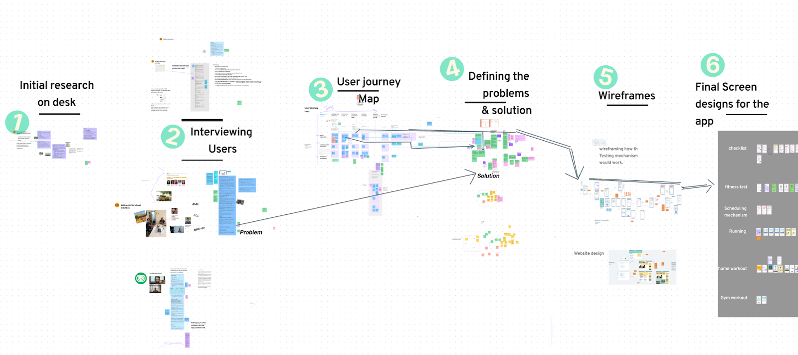
This is a map of everything that was done during the project. You can just read the 6 titles in order to get some context.
2. Image showing zoomed out version of the image above. The work involved everything from interviewing people, to writing up solutions ideas, to UI design.
Caption: you probably know this by now, but let me repeat it. The image on the left is from user interviews I was taking of people who’ve recently gone on a trek. And image on right is a screenshot from the time I wa working on UI.
3. ⭐️ and here’s the most important story that’s happening here. It’s the map explained.
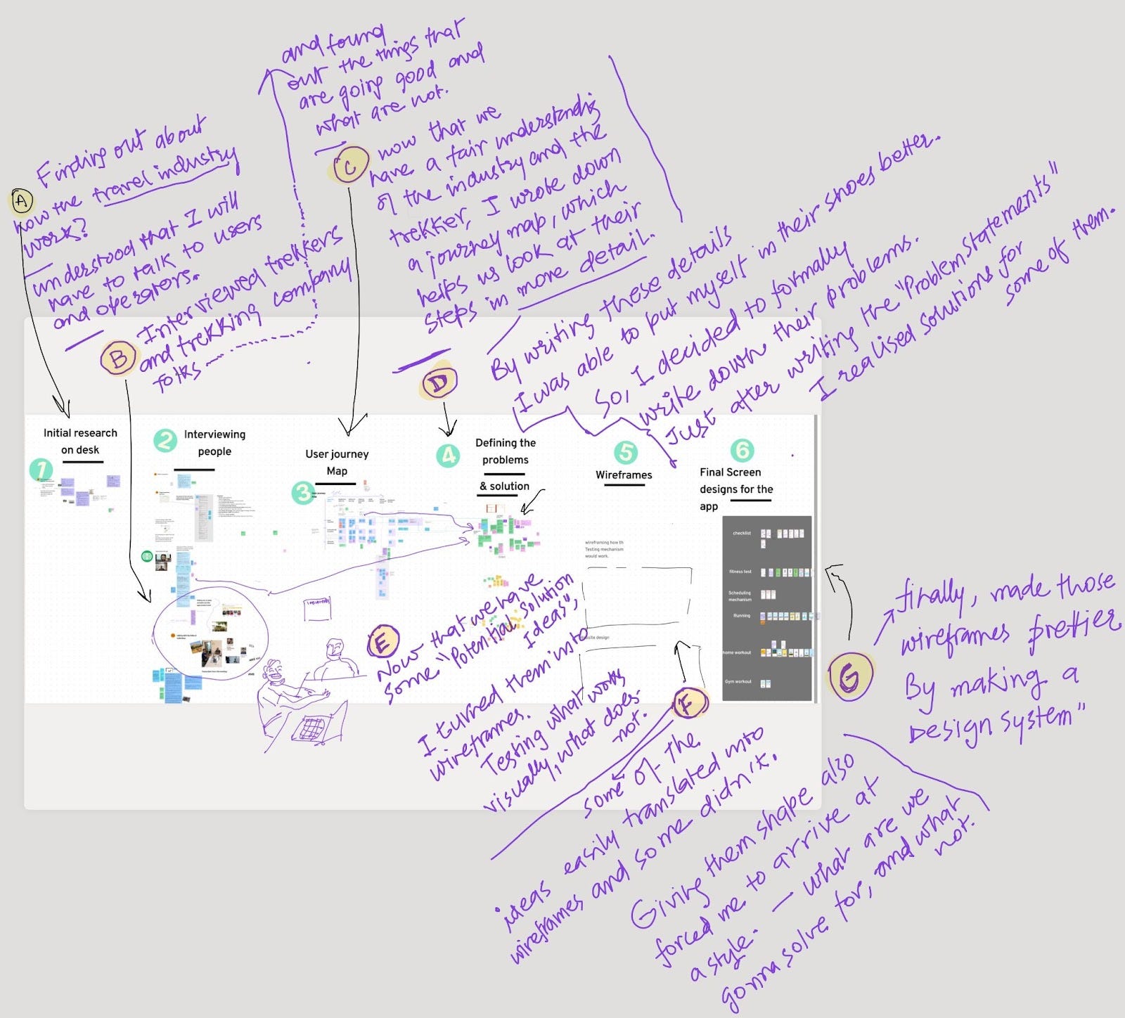
This is what the summary of this is about. Now in the next sections we’ll do two things:
- 1. we’ll see highlights from the whole app.2. Finally we’ll see the app that I designed, as the solution.
2. Three highlights from the story
Let’s zoom the map, and look at
2.1. Selected highlights from the process
Highlight1: RESEARCH. or Desk-research+interviews+journeyMaps. or How Indiahikes people helped me make the user journey map.
interviewing people,
I started by searching for how they earn money, looked at a bunch of researchers, in hopes to better understand their business model, and to look at how other people are solving this problem. What’s the difference between a trek and hiking?
some findings were very particular to very rich countries. There were also some insight that are relevent to our app. I’ve kept some of those insights here. dpcd
But soon I understood, that it will be very important to talk to people who’ve recently gone on trips. and also the organisers. ended up talking with
- Pragya, 28, used to live in canada, going on her first trek.
- Ansh, 23.
- Madhusudan, 40, from Bangalore, had gone on a bunch of treks before.
All of these folks, either didn’t prepare their body before going on the trek. some because they just didn’t try, and because they felt they didn’t need to. pragya wished if there was a way to filter all the treks better, Ansh told that he goes on the treks for getting away from society. Madhu also does the same, he’d gone on the trek for (you can read in details in the figma file.)
ok, so many of these probelms are easily solvable. what are trek companies doing about it.
With that in mind I searched for the trekking companies nearby,
some companies came up,
some travel agents came up,
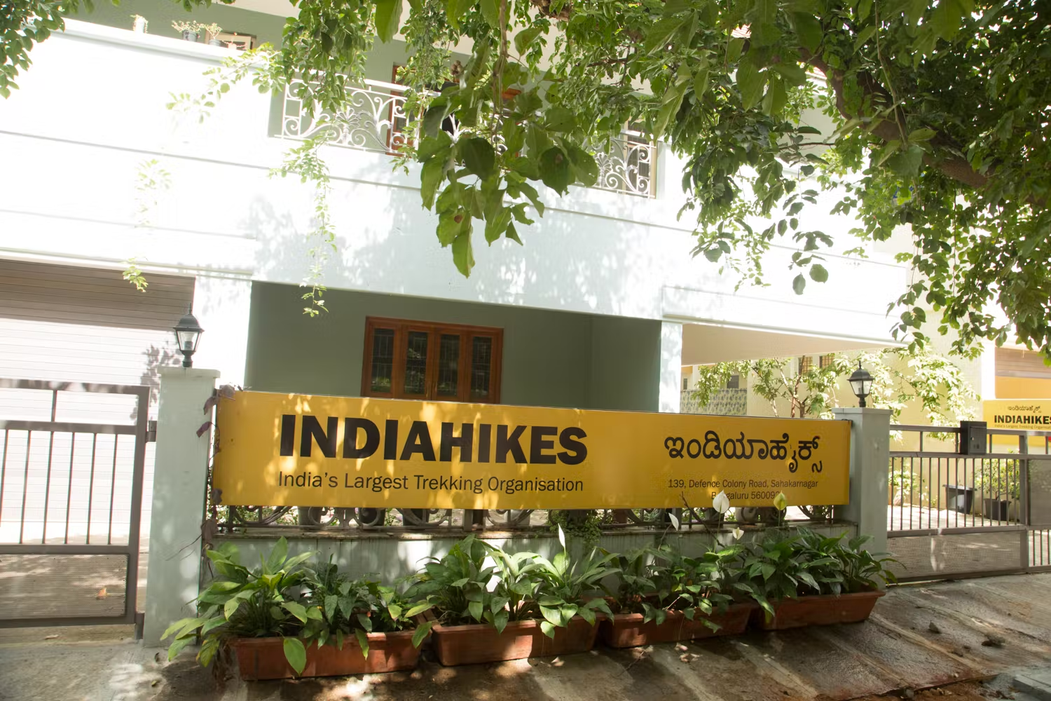
Called the nearby travel agents to better understand how this happens. And it seemed like they don’t really provide a whole trekking experience. But one company stood out, it was Indiahikes,
but before that I did more reseach about them, their website, their youtube videos, found a ted talk by their founder, it was inspiring, it talked about the transcendence you get by trekking. he also mentioned that they have an office in bangalore.
They have an amazing website and I knew it would be a goldmine if I get to talk to these folks, But I also knew that I won’t be able to get any of that information out of a phone call.
So, I revised on my researching concept, looked at the notes from the time Koel, taught us about UX research. And made a strategy to about what I’ll talk to them.
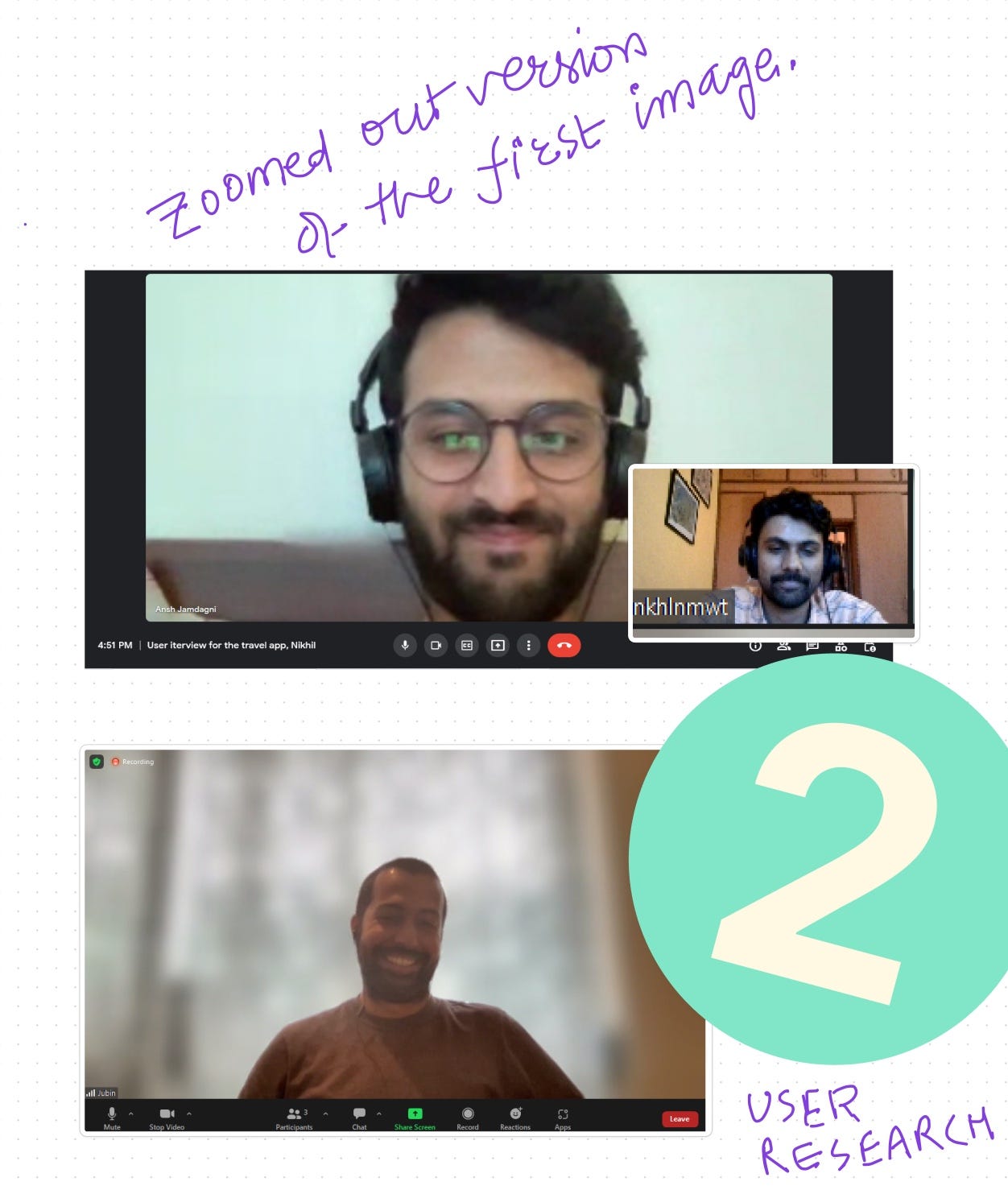
Finally I boarded on the metro, and reached their office.
I went to the Indiahikes office in the metro
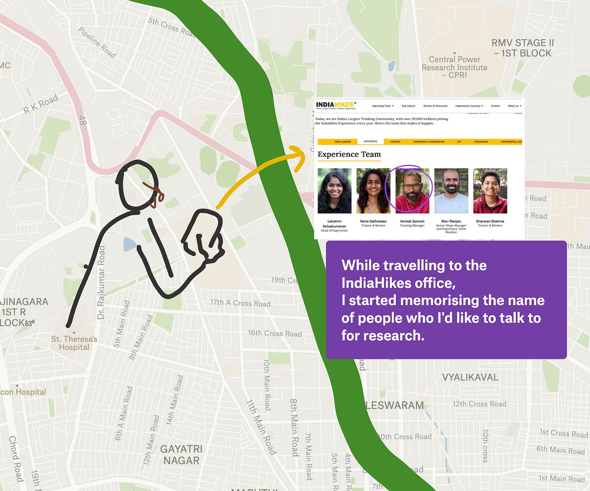
- — in the metro, I went to their about us page, and memorised the names of some of the people working there. — the security gaurd stopped me, so I told that I’m here to meet my Arjun. he took me to arjun’s office, he was talking to someone, so we had to wait, and in this waiting time, i started talking to some other folks in the open area of the office, — I spotted a very nicely dressed man, and shook his hand firmly, and told him that I am from a group, which wants to design something for them, and for that I’ll have to talk to the fold from the EC team (experience coordinator) — he said he can help me with that, and took me to the head of the team, and told him that he wants to ask some questions for 10 minutes. — I think by that time, the security gaurd understood what I was doing there, but didn’t say anything.
Great, now I had the 10 minutes with the, who basically is like the experience designer for the treks.

Ok, so my task here was to earn his trust, so he talks about the deeper problem of the work.
— i decided to be vulnerable there, I passionately **explained the importance of a user journey map,**, where I’m stuck and that we are targeting people going for 2–5 day trek — and then I went quite, let him speak, even if he was not telling what I wanted, I didn’t interrupt.
— **Insights from our conversation:**
1. How does one decide to go on a trek?
ans: they just go: movies, instagram, close relative went on a trek — and now they want others to experiecne that.
2. Do people come in groups? how does that group form amongst them?
ans: Ayush said 60–70% people people come alone, no group. the rest of the group, either gets created with people who they’ve gone on trek with.
— the group size rarely exceeds 3 people.
3. Do people come with the preparation?
— they usually don’t, so they are called by EC’s (Experience coordinators there, to keep track of their journey and their journey.)
— ECs check their progress using the Nike app.
4. Ayush talked about how they try to reduce people who don’t exercise, and people who throw out a bunch of garbage on the treks.
5. he talked about something called a Deloading probelm. A deloading problem is where people take up a lot of stuff, and then since they can’t carry it, or are not prepared well, they end up de-loading their bags, to the Mules nearby. and how this becomes a problem. this robs them of the full experience.
6.- He then went on to talk about how Indiahikes solved this problem by making the UI of the website such that it becomes harder for them to select the deloading option. — this cost them money, as they might have lost a bunch of traffic from people who were only interested in trekking if they could deload, but they still did this, because, he says that it aligns with their brand, it aligns with their values. he said now we had people who all cared about preparation, and fitness.
7.- He emphasised the importance of the transcendent experience one gets when they do the adventure travel, and how it is a chicken and an egg problem that they can’t explain it to someone who hasn’t been trekking before. but they only need to know it the most.
8.- He mentioned that their core values are: safety, communicating that this is a sport, do the right thing, and be humble.
— they provide info about how to come from nearest airport to the trek.
— other than this, I also got introduced to a bunch of trekking-industry-jargon, like AMS, Slope, ECs
I’m really thankful to Ayush and Ganesh to sit with me for such long sessions and give out details about the whole experience.
**Thanks only to them that i could make a proper user journey**.
2.2. Highlight2, People don’t exercise before. How do we solve that?
I want to start by 3 datapoints we got from the research:
Most of the first time trekkers i interviewed did not do any physical training to prepare. (pragya and Madhuranath)
While talking to ansh, I also found that, one time he and 3 of his friend were going on a trek and one of the person, was not couldn’t continue the trek, so they had to back up.
We also saw the lengths indiahikes goes to in order to avoid the people who are not prepared.
Ayush (from indiahikes team), kept mentioning how people are not able to fully experience the trek if they have not trained for it previously.
so we see that physical fitness is of huge importance. Then why do people not do it? I asked people and here are their answers.
they don’t know what to do — they don’t want to plan another thing when they are infact doing the trip to get away from schedules (Friction) — They think that since they do this exercise they’ll loose their muscle that they’ve gained — they feel emasculated doing exercise — they don’t think there’s a need to.
how did we solve this?
Before I answer how we can solve this fitness problem, let me talk about a broader problem that we are solving here. solving it will not just help us for this problem, but also the problem described in highlight3. it’s important to talk about that first because it partially solved the fitness problem as well.
Ok, so I decided that all the communication that will promote/mention this app, will present it as “a minimum checklist, that this is the app that will only help you prepare for the things that are necessary for the app.”. I had made a JTBD for the same, although I couldn’t get a lot out of it, but one thing that stood out was that peopel don’t want to think about what should they do.
— now the reason for that is because people end up feeling FOMO, they’d watch many youtube videos on trekking, and still won’t feel that they are missing out. — a second reason is the friction, not knowing what to pack, what workouts to do. further, not knowing what is essential, and what’s not essential, endless youtube videos don’t help with them either.
So, if we place our ads correctly, we will be able to latch on to the FOMO nerve here, we’ll be able to tell them that hey, there’s a solution.
so now we have this “minimum checklist/minimum training app”. (we’ll see the app later). Now that people have this context that this is the app, which tells us the essential-things-only, they can give peace to their FOMO. (so one problem solved)
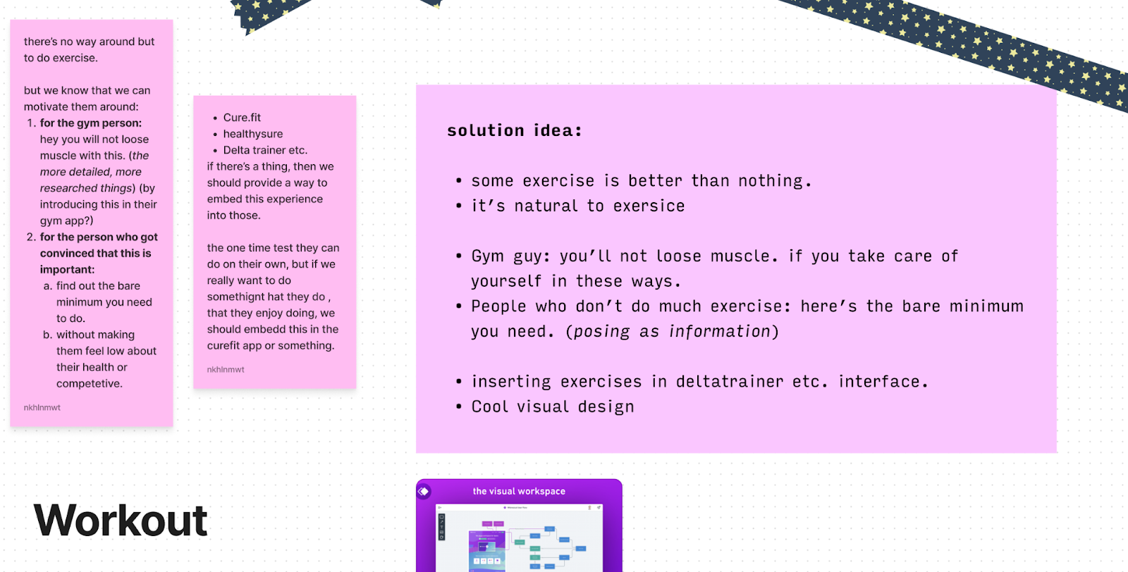
- Now, how do we initiate people to do more exercise? — for someone who already uses a workout app like curefit, we provide ways to insert trekking training in there as well. — roughly by talking their language. (for the gym guy: you’ll be able to maintain your muscle if you prepare for training, for the couch potato: hey, these are only the least amount of exercises) — by talking to the extreme ends of the spectrum, and everyone in the middle will be convinced. (talk to the gym rat and talk to the person who doesn’t want to move) — By telling them what will happen to them if they don’t do the workout.
- Finally what it looks like in the app (wireframe).
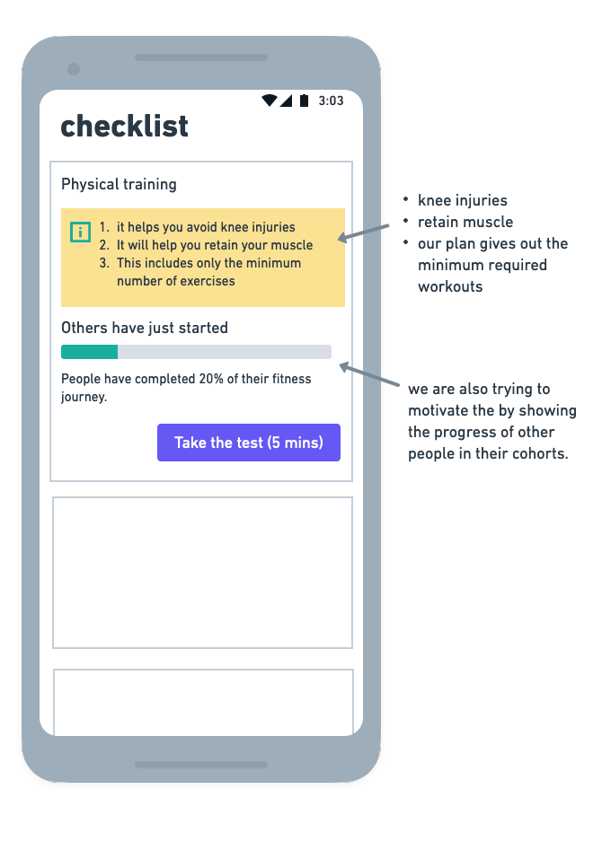
this bar only shows up if their cohort folks have completed an amount that is coverable.
2.3. highlight3: Discovery problem.
- As we saw in the previous section, one of the problems that Pragya mentioned was that she “Wishes there was a way to filter out different treks” But indiahikes provides filters. Then why could this highly educated girl, someone who handles a whole business, can’t figure that out? here’s what I think the reasons are a lot of companies, advertise for tickets when your search for treks, people don’t know if the word to use should be trek, or something else. — so they end up not being able to distinguish between, which sites book only the bus/train, and which ones are for booking the whole trek. — another reason is that a lot of these search results don’t really speak to the state of mind the person is in while searching these terms on google.
- How did we solve this?
two ways. First By customising what shows up on google, based on what they searched.
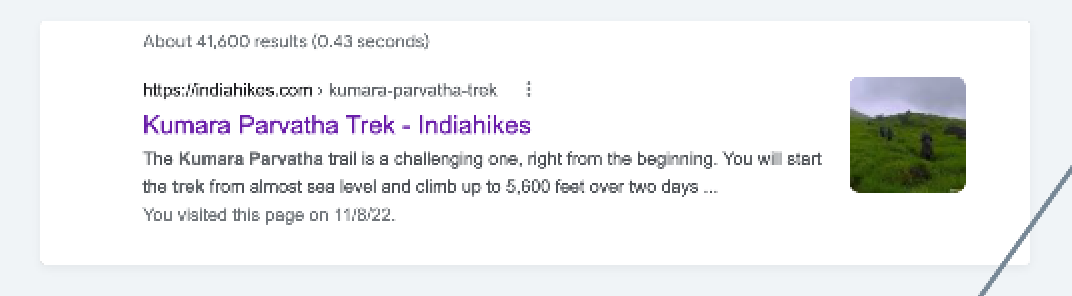
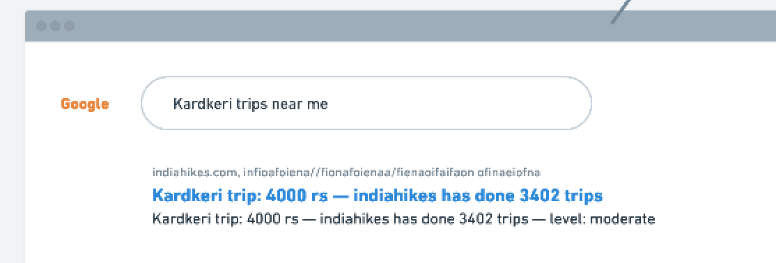
1. They searched “Kardkeri trips near me”, that means, they need to see two things: 1. that we have the trip planned available. 2. that indiahikes has done many trips there. and finally in the smaller text, some information about the price. Price is important to show because they are probably in the thinking whether they should go or not phase.
2. if they search for Indiahikes, so maybe they know about the company, let’s try to introduce to them some other reason to get it.
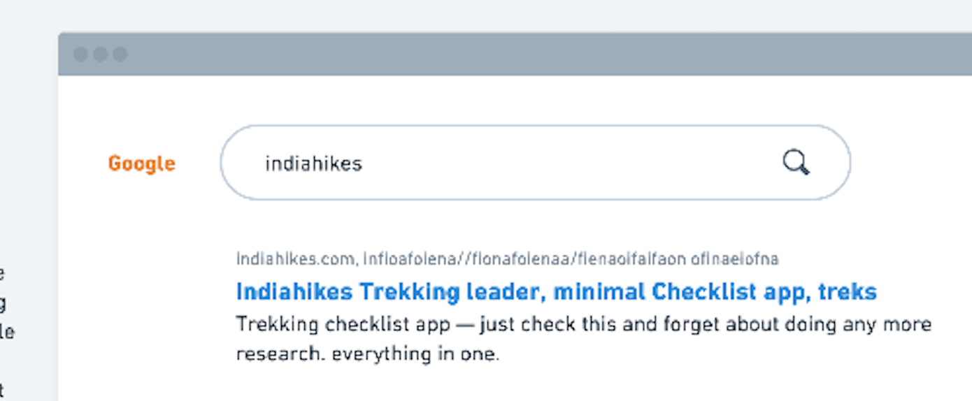
this might have looked like SEO optimisation, which it is, but it’s also improving their experience, because if they went with any of the other websites, they’d be lost, because any of the others sites have minuscule content compared to what indiahikes has.
Second
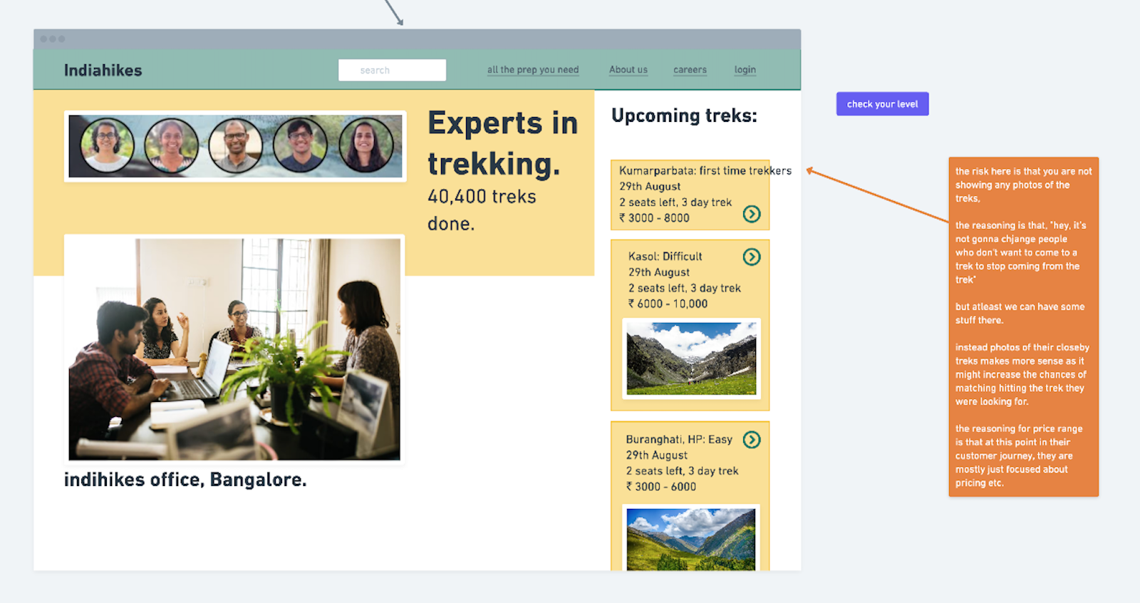
If someone clicks on one of the links, be quick in telling them that “hey, we are real people, we have an office, etc.” (because the problem that we are trying to solve at this point is that the user doesn’t even know whether these are real companies that help us in trekking, or just some travel agency ad.)
How can we prove that we are a real company?
by showing faces of the people working there at the front page. (previous page was showing a photo of a mountain from the himalayas)
- wireframe for website design
- these are the photos of people who really work there, and their real office, the idea is that anyone can find pictures of mountains, but only real companies can do this. other unusual thing i’ve kept here is keeping the price on display, with large ranges, again the reasoning being to pull them in at this point. coming back to the problem that Pragya mentioned, “that she wishes there were a place to filter through different treks”, will automatically get solved, as she’ll end up on the right website.
- Page for people who know about indiahikes, searched the correct term we’ll present ourselves as a brand that provides a complete experience, so that you can achieve that transcendence, that people achieve with trekking
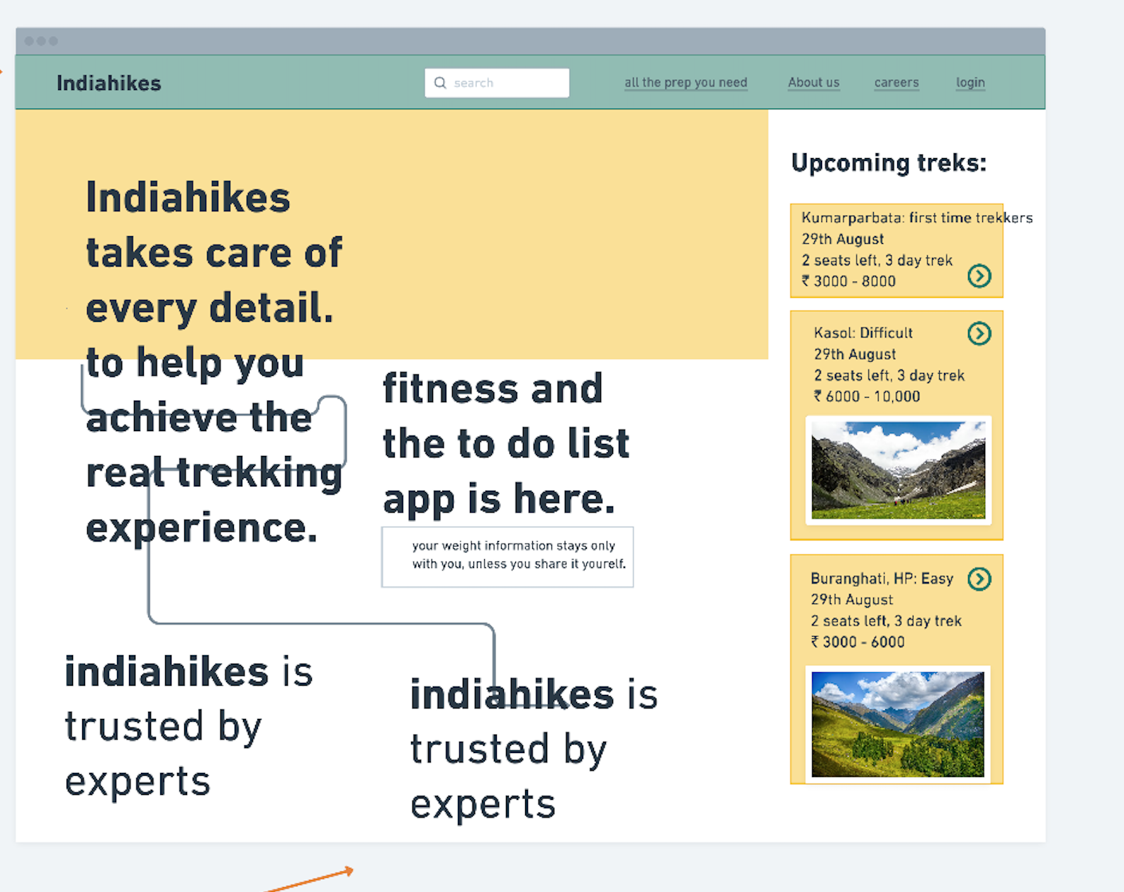
- With this design we are emphasising that we have an app that allows you do the fewest number of things, for the best trekking experience. This website design helps them Many of the people just want to not bother about fear of missing something out of their preparation, and training. here with this website
- Ok, so to summarise this hightlight,
- 1. we saw that, the reason people don’t are not able to distinguish good websites from bad ones is because they don’t know if how trekking companies work, are they travel agency ads or what? We solved this problem by customising the search results based on where they are in their journey.
- 2. we also saw that for people who already know indiahikes, it might make sense to expose them to the concept of A preparation app, that just talks about the must haves for a trek (it’s also a fitness app, with the same philosophy of must haves)
OPINIONATED DIRECTION: Now this last thing is a stylistic/opinionated decision, I took this decision because I think folks at indiahikes are doing things the correct way, and I don’t think it makes sense to change any of that, they also have great content on the website, the only thing we can do is curate it. This is the first introduction of style (by style i mean opinions). In the upcoming sections, we’ll see how these stylistic decisions will become the guidelines, for the app that we are gonna design. what decisions? decisions around, hey, are we making this a marketplace or just a play to improve their experience. would it make sense to make this a company that estabilishes a gig economy for people who can help early trekkers? I took these decisions, mostly based on my understanding of the trekking industry.
here are the those decisions:
- 1. An app that accompanies already existing trekking companies like Indiahikes.
- 1.1. I’ll assume that they are doing this not just to get more customers, but also to increase their softpower,
- 2. one of the goal is to increase softpower for indiahikes, as they might want to use their own app, instead of Nike’s.
- 3. To provide more customised experience.
- 2. for someone who wants to just get stuff done, but also wants to achieve that transcendental state that trekking provides.
- 4. To reduce EC calls for obvious questions.
3. **WIREFRAMES AND FINAL SCREENS**
- Let’s go through the first
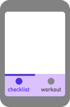
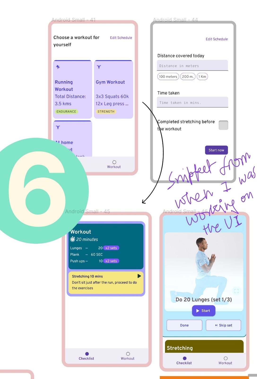
app can be seen as divided into two main parts, checklist and workout
sketch showcasing that the workout and the checklist thing
The app can be seen as divided into two main parts:
- 1. Checklist part &
- 2. the Workout part.
Let’s go through the checklist part first.
3.1. Checklist part of the app.
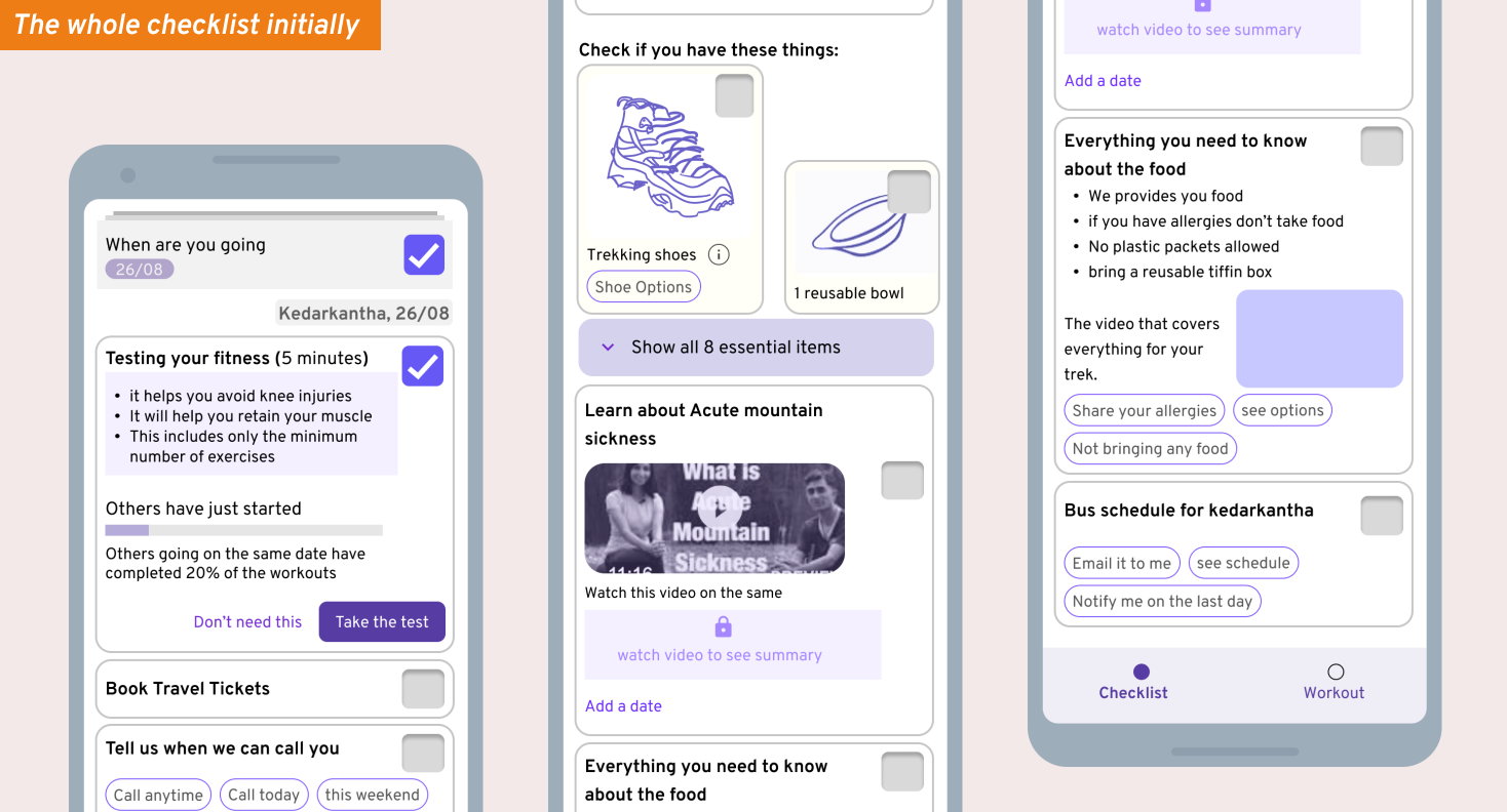
How does an app take shape? well, you look at it’s **what should be it’s purpose** and the **broader ideas we want to execute with this**.
what are those -ideas:
1. — the purpose is to get people away from feeling the FOMO, by assuring that all the necessary things are there in the app.
2. — They should be able to check off the things without having to learn new about how the app is structured etc (in other words, simple). This is important because it’s not their email app where they will go and **pin this task**, or put something in the starred folder. Infact the whole idea as this list is all the important things only, so we can’t have something else.
3. — We won’t allow them to add any new tasks to the list by their own. why? because then they’ll have to think about the severity of the tasks,
so that it’s clear in their head that “hey, this is all the things i need to check off for trekking, it’s the one place i go for quickly looking at what’s remaining from trekking.”
4. — casual, language based UI.
ok, so now we’ll see how these ideas are permeated into all through checklist UI in the following notes (understanding the checklist UI):
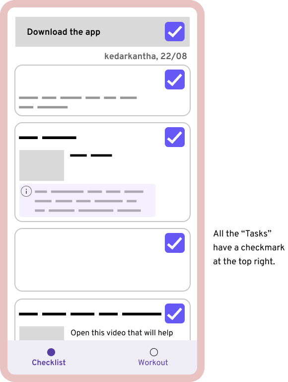
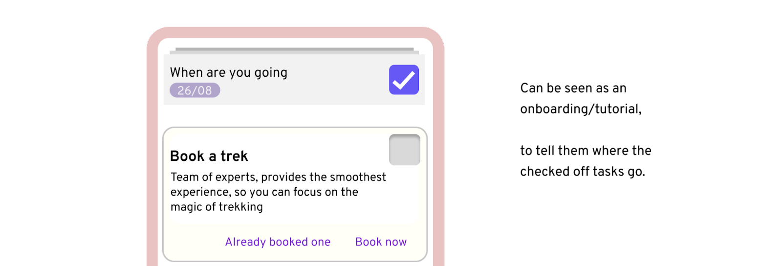
Caption: Image showing all the checkmarks kept to the top right of all the “Task cards”. The reasoning behind this decision, is explained in the paragraph below.
here we’ve kept the checkmark consistent across all the tasks of the checklist. because if someone just wants to check things off, they should be able to do it. Even if for something where a checkmark doesn’t make sense, we’ve kept it as it, as it will save them from wordering “how to get rid of the card in front of them”
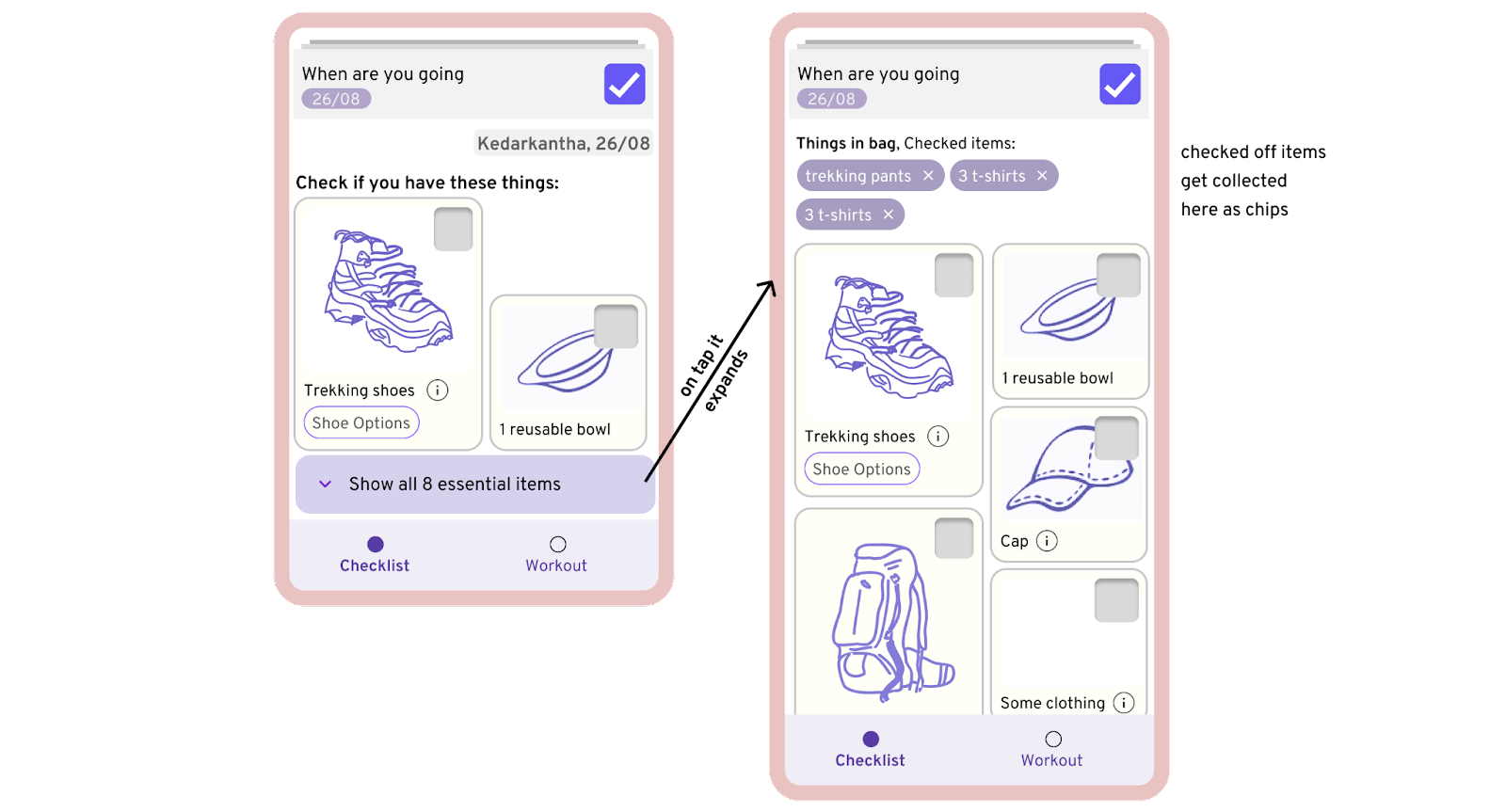
- caption: The whole checklist part of the app. Below we’ll be talking about this structure.*
— The whole checklist can be scrolled anytime, you might have noticed this from looking at the whole checklist. it’s upto them if they want to look at the whole list now, or check off things one by one etc. again this is motivated by the idea of keeping the UI simple. To keep it in a way that users don’t need another framework to understand it. and they very well understand the framework of scrolling.
— Teaching them how to check a task off. here they see that the checked off tasks sit up-top, so they understand how to get back to them too.
CHIPS
an overview of the chips
when someone has an nut-allergy, some other allergy, say, they can choose to just click on the chip and we’ll get it. nothing else changes, they can choose to mark the card done or not do anything.
now the reason chips were chosen for these tasks was because if it was a button, then it will appear like the main task, that they have to answer. And since most people will not have a nut-allergy say, it wouldn’t be appropriate asking them for this. whereas, if chips might only be noticed by someone actively searching for “nut allergy”. I think people will understand this, because they’ve already learn this interaction, when using gmail, and other products, where the product suggest an automated replies to a mail in the form of a chip.

Checking off THE CLOTHES and Equipment:
The idea is to give them an option to print out the bus schedule, so that they don’t have to rely on their phones only.
SOME MORE MISCELLANEOUS STUFF ABOUT THE LIST
1. since people can very easily check off the tasks, what is someone checks off a card without doing the task written on it? what if they check off the card that tells them to workout, without setting up a workout first?
Ans: Ok, so yes, these problem can happen, but for the most part we’ll still go with allowing them to check off anything. But with the exception of some cards like “the workout card”, in these exceptional cases(which are set by the editor, only card based logic, so they won’t have to do it again and again), they’ll be able to dismiss the card, but a note will appear at the top. which asks them if they’ve done what they wanted to do?.
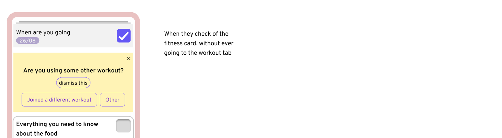
Caption: yellow card appears very rarely.
2. — A couple of notes about how I think this is how it should be:1. first I wrote down the principle guiding what the list should be and what it should not be, and then I made the different possible components and cards, looking at the content provided by Indiahikes to cover all the situations.
2. secondly as you see in the third screen, if it’s been more than 2 since the pending workout. it gets deleted and we see the grey note. In that case, the remaining workouts become a little more difficult. (*if there’s a scope ofcourse*)
3.2 workout part of the app
what if the person is coming only 2 days prior to the day of trekking, will they be able to utilise this workout app? No. They won’t be able to fully take advantage of this app. they’ll still be able to use it and do some workouts, but it’s designed for people who are setting-up the workouts about 15–30 days prior to the trek.
Ok, let’s dive in:
The first thing that you do with the workout part is, that you take a **fitness test**.
Where do you find this test?
Two ways:
1. By clicking the workout card from the checklist.
2. or by simply going to the workout tab. and starting it.
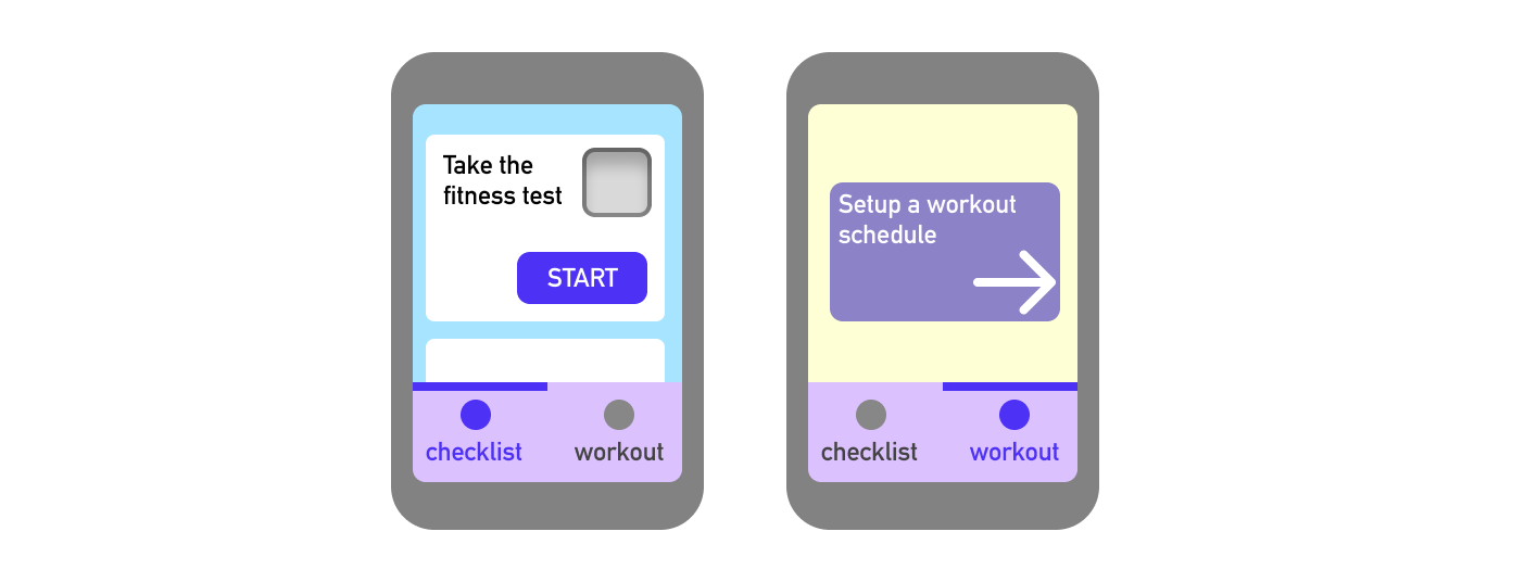
Caption: Two ways of setting up a workout
What is this fitness test look like?
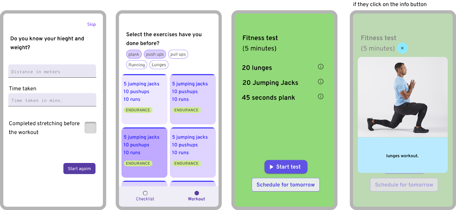
caption: in screen no. 3, they see a workout test from the options, based on the the “exercises” they choose. similar workouts on different levels are right next to each other, and the hard the exercise, more intense the color. there are only 3 level of difficulties.
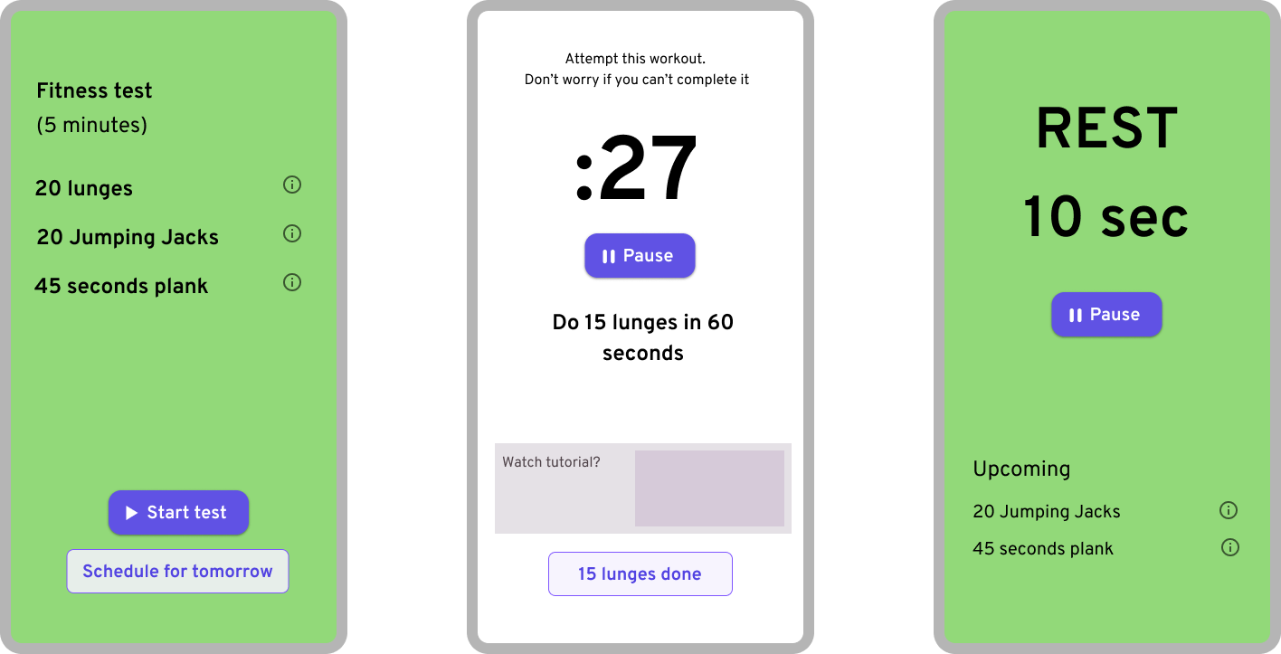
here’s how the workout goes.
Just after their test is done, we have to make them schedule the workouts.
Once they are done with the workout. They see their stats like this. which they can edit.
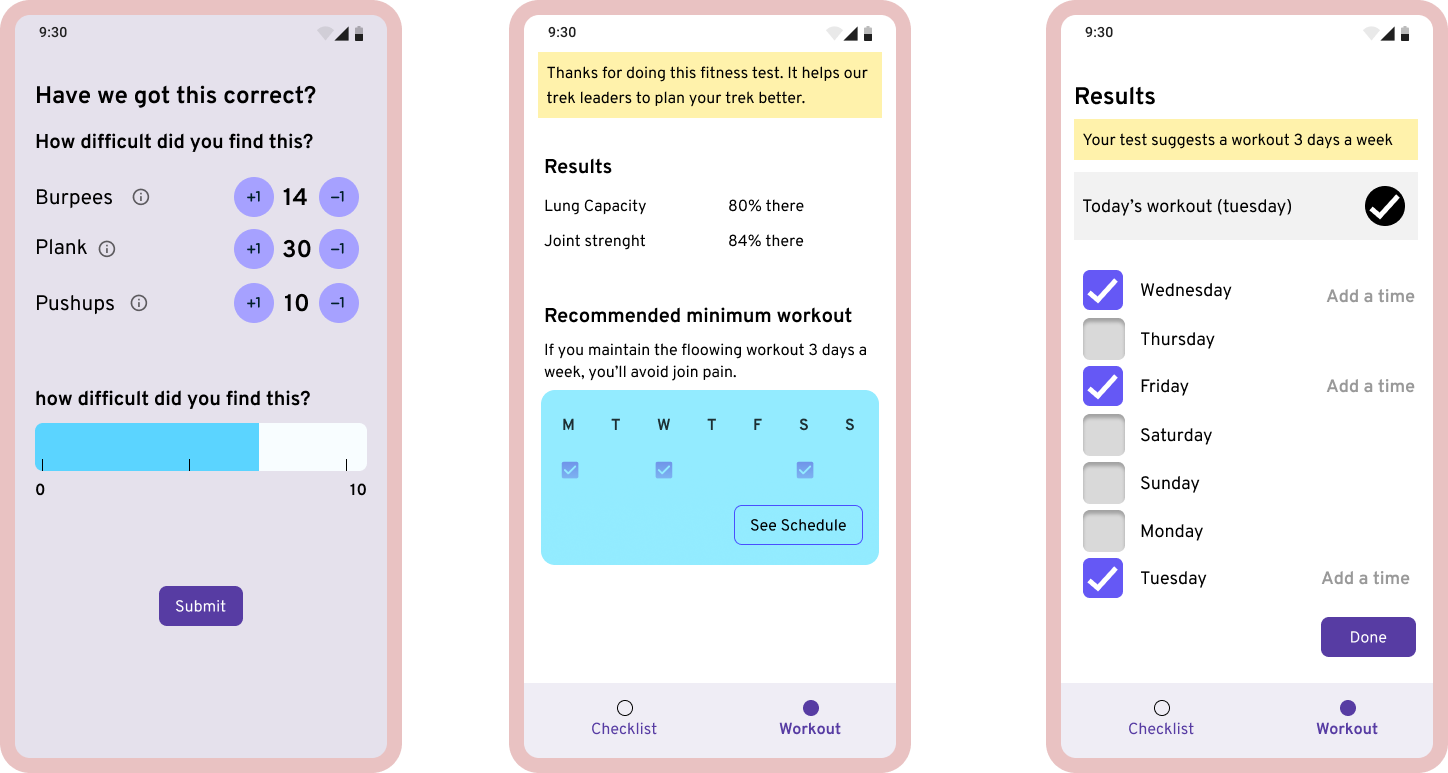
let’s look at what’s happnein in this image.
1st screen: they are confirming the information about the workout they just did.
2nd screen: They see the result, but that’s not where we want their focus to be. we just want to show them the schedule, so that’s the main thing on the screen.
3rd screen: they get a autofilled schedule, which is upto them to change.
This is how the test and the scheduling happen.
What we just saw above was a one time thing.
Let’s see how the workout page looks like on their day to day
now that the setup is done.
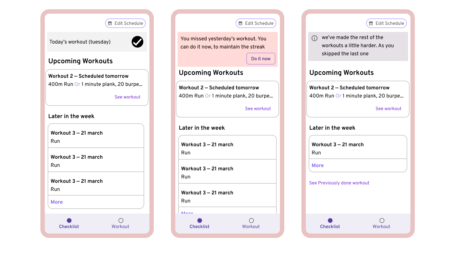
ok, let’s acknowledge what’s being shown here. 1. if someone misses a workout they see this red note at the top of their, screen, which allows you to do the missed workout now.
2. secondly as you see in the third screen, if it’s been more than 2 since the pending workout. it gets deleted and we see the grey note. In that case, the remaining workouts become a little more difficult. (if there’s a scope ofcourse)
ok, so till now we know how scheduling the workout works.
But what happens when you click on one of these workouts and start one?
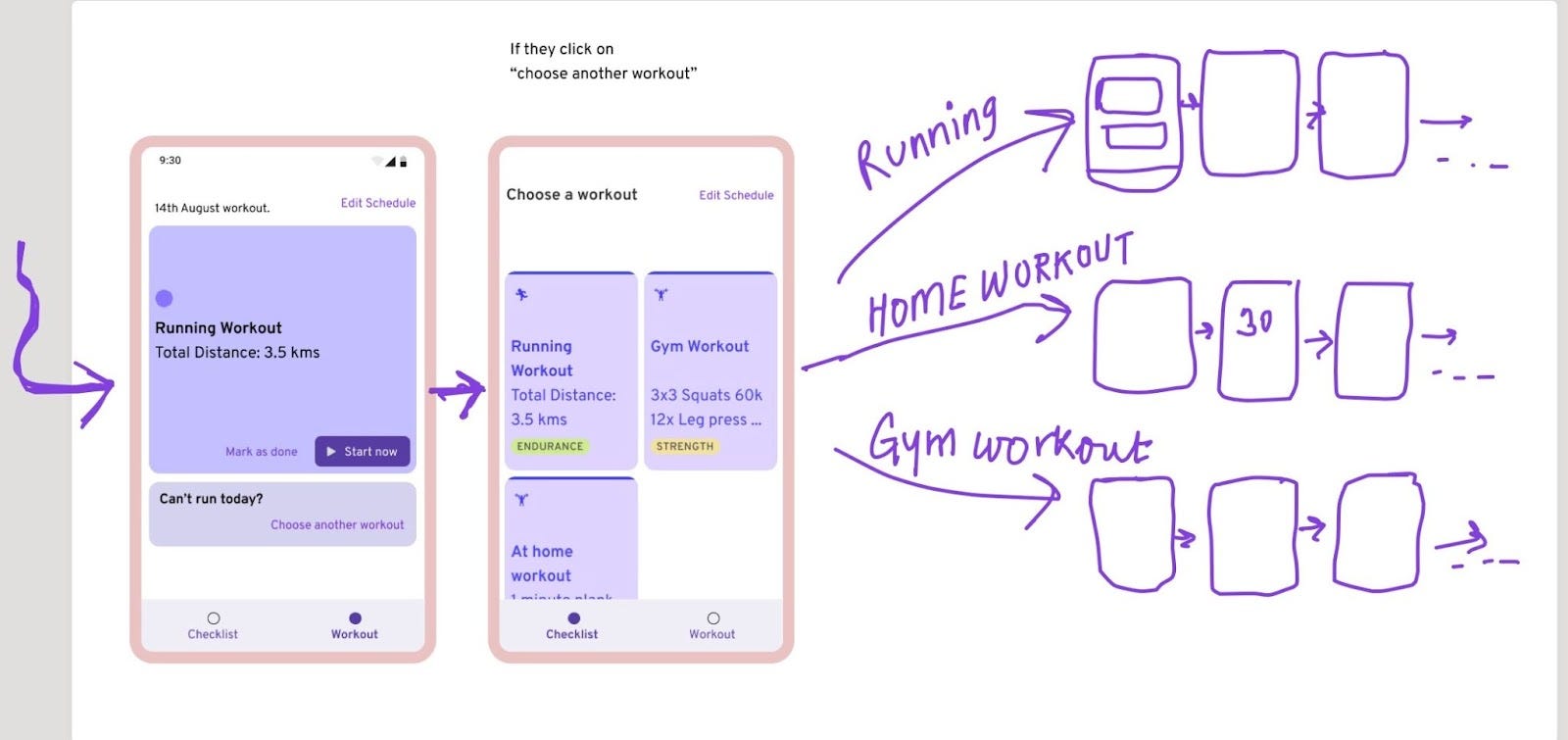
the flow diverges into 3 different ideas.
Wait, something wrong.
Why are we splitting the workout into 3 different flow?
— In short, it’s because some workouts are timebound and some are not. so because of that, some workouts can autoplay and some can not, for example you can do a set of jumping jacks, followed by a set of lunges, with your phone autoplaying one after another. But you can’t do “bicep curls” followed by “lat pulls”, in sync with your trainer (phone here). there’s one more case, that we’ll see in the pictures below.
Home workout
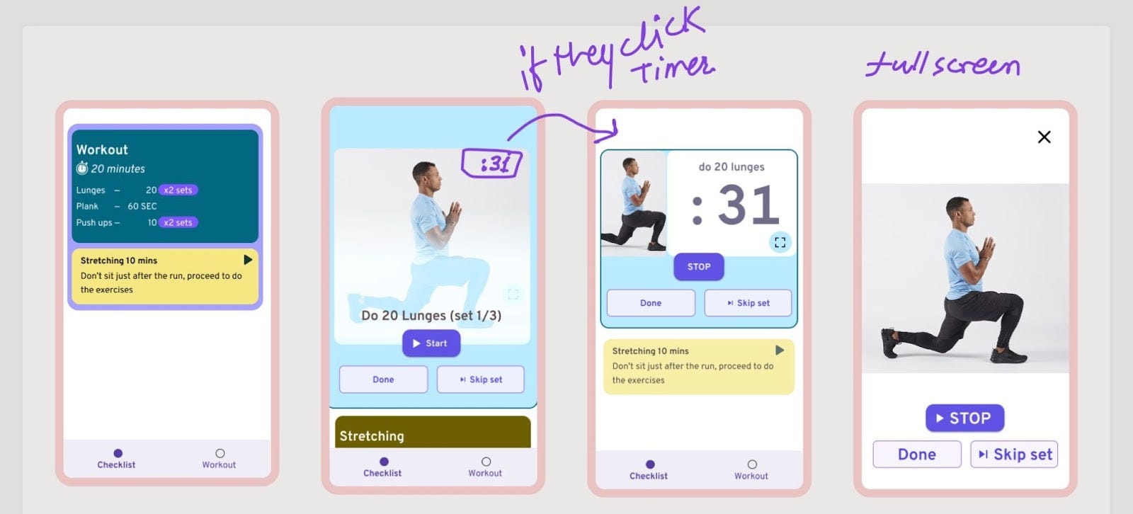
Some important screens from the home workout flow.
We autoplay one exercise after another, and they can skip the current one if they like.
They’d have to do this if there’s no autoplay.
Running Workout
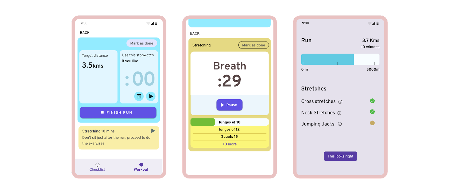
screens during: running, stretching(and cooldown), your numbers that.
— again, it’s very similar to the home workout, except that here, we don’t keep a way to see a video tutorial, assume that they know how to run.
— one thing to note here is they get a timer, which is optional to use. it’s communicated with the copy that it’s optional to use “Use this timer, if you like.”
The gym workout
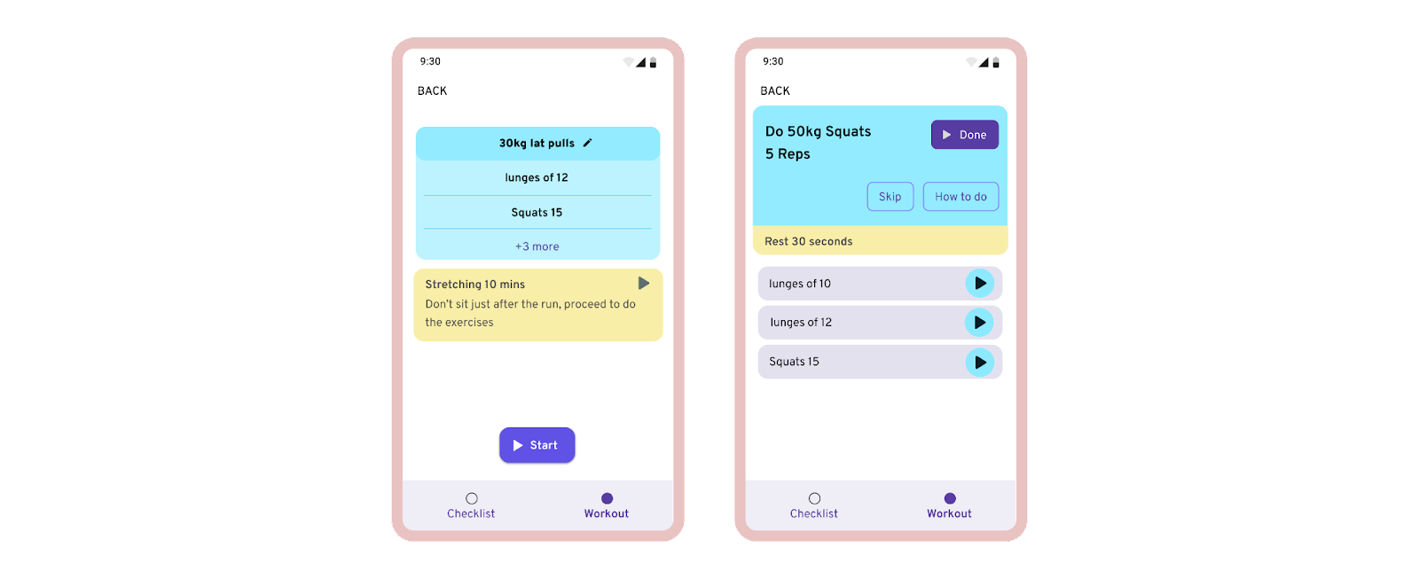
here’s where we see some difference from the other two.
— they see an order beforehand, they can do the workout in whatever order they like, both before and during the workout.
— there’s no timer, except for the rest part. (for obvious reasons)
— no video support, (they can peek the info icon where they get a gif though.)
— finally the streching part of the workout will be same as others.
One more thing:
There’s one more thing at the start of all this workouts.
Where they can change their scheduled workout to some other one. like from running to gym.
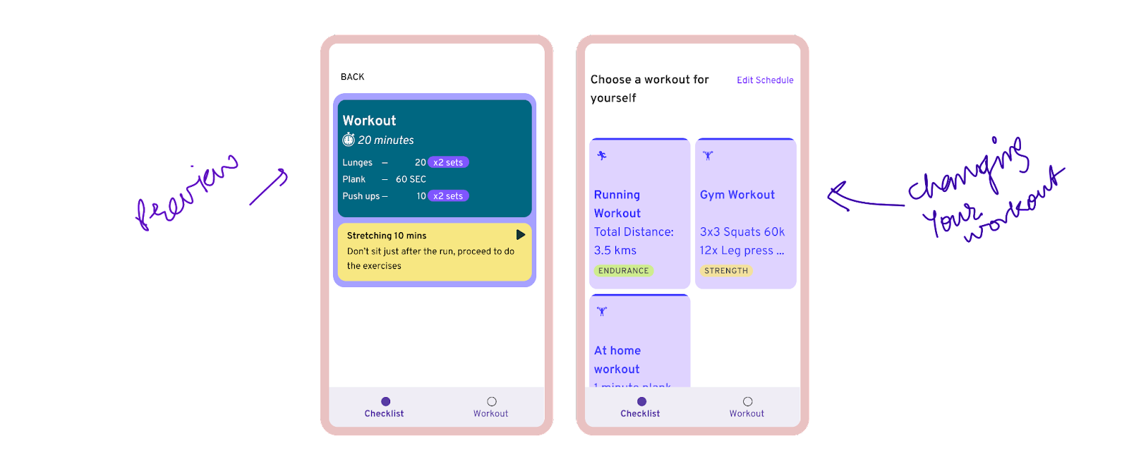
we provide this only 3–4 times (if they are doing good), because it might not be great if someone comes to the gym-building irl, and see that they have to now do the home workout. And of-ofcourse, they can always mark things done without actually doing them.
you can find the whole thing in a Figjam file as well if you want to go in depth and read all the things that happened. https://www.figma.com/file/G2Cvl1Laor0XOm38rdXaDx/Trekking-product