—— H O W · T O · U S E ——
Scroll.
Works will be on the left, and info about them will be on right. Just read the bold text if you are in a hurry.

Nikhil Nimawat's
PORTFOLIO

← stuff that I couldn’t fit in this portfolio below ↓


Index
These are catagoried based on the discipline that is used the most in that particular work, but obviously in each of these projects disciplines overlap.

Storytelling Work

Illustrations for Blogs
Posters


Editorial illustrations for blogs

This was made for a blog that talked about Voice tech for the next billion users. The blog described how voice tech is the place where next Billion users will be. Various interviews were conducted as a part of UX research, and mostly the people who were conducted were working class people around Bangalore. I was supposed to capture the difficulty the Indian people might have with working with apps essential to their work.

A College kid leaving for college, we launching our product in beta. Play on the word “beta”

This was made with the blog describing how if feels like to come up with a new illustration style

Editorial illustrations for blogs

Emailers
The First Illustration is placed with an emailer which is titles “our beta is leaving for college”this is a play on the word “beta version” (which is a common word for “Son”). They describe the feeling that they get launching the product is similar to this.

Second one was about the updates since the last quarter. The subtext for the image is that we are showing ourselves humble. And it was full with the technical updates and achievements that slang labs team has made in that time, we didn’t want to write it out that we are humble but rather subtly show that through that illustration, as we are giving the power in the hand of the reader, and slang labs is posing like a nervous kid showing his report card to the big man.

A College kid leaving for college, we launching our product in beta. Play on the word “beta”

This was made with the blog describing how if feels like to come up with a new illustration style

Editorial illustrations for blogs

Image one was made to go with the edition of the blog which included the experience of being at the Google I/O event. another requirement with both was to keeping the brand consistent with the previous work(color schemes).

Second one was about the updates since the last quarter. The subtext fot the image is that we are showing ourselves humble. And it was full with the technical updates and achievements that slang labs team has made in that time, we didn’t want to write it out that we are humble but rather subtly show that through that illustration, as we are giving the power in the hand of the reader, and slang labs is posing like a nervous kid showing his report card to the big man.

Posters

This poster and the one on the next page were made as a part of the marketing campaign for a co-working space “Work365”. Work365 told me that they feel that other co-working spaces are offering too many side activities which don’t really contribute to working, and they want to target people who think the same and want to get work at a place that is more invested in improving their work, like taking care of ample space for desks. The illustration is showing the extra-activities occupying all the space that it is being a barrier for the person with the laptop to do work.

Design Work

UX & Visual Design

Keito, layout and illustration design journey

Screenshot from the Cendrol website for Desktop


Mobile version for the same package descriptor

Catalogue descriptor design for web


What it looked like before ————————————————

Cendrol is a construction company, with the package descriptor, they are putting up an easy way for the customers to find out the information about the house plan they choose.


With our design work we've tried to combine the above 3 pdfs, which listed out the different contruction plans and what you get with them saparately. Doing that was a problem for them as they had a hard time comparing the pdfs with each other. With this website design they are able to compare the differences in the different plans without much hassle.


Console image 1


Console image 2

Slanglabs: details in console(web app)


Purpose: provide a point of delight to the developer using the console by Slanglabs,
These keep changing as the developer makes more projects with the console.


Constraint: to make it look like it goes well with the very well designed(and developed UI of the console.)
2. to make some landscape.


Feedback session. Slanglabs website design.


First I designed with something in mind,
then I sent it to a couple of designer friends.

copywriting: Ved Mathai, Slanglabs


Brochure for Cendrol

This Graphic design project is about making a brochure for Cendrol construction.
Design language, typography and every-thing else except the text for each spread, is designed.


Reference book: “Grid design in graphic design”
(Cendrol is the first construction company in Bangalore area to introduce an application for tracking the construction process. Thus, justifying the sporty and the technically equipped nature of the company.)
The content was provided from the copywriter, Ashish Sarma.


Branding Work

Graphic Creation
Product Illustrations
Finding Illustration Style
Packaging


Product Onboarding and web illustrations

The next 4 pages are about the making of this illustration style shown in the adjacent page and the next pages.


For making this illustration style I was given this brief. The idea was to make something “quirky but professional” and avoiding the clichés of illustrations on the web, which are filled with soft curved vectors of humans figures. As Khoi Vinh describes them as monoculture, in his blog.
https://www.subtraction.com/
2018/01/03/two-different-kinds-of-illustration/
contd.


Product Onboarding and web illustrations


Contd.
The process started with me coming up with different styles, regardless of the subject matter.

Color scheme was already set, it’s bluish green and orange were the primary colors and supporting them were a faded yellow and this blue.


We chose to go ahead with the third style, shown adjacent.

Subject matter. Since using human figures was not an option, but we had to show some expressions, so, instead we chose to use "hands" as a repetitive element , as they are also quite expressive.

Contd.


This image is part of the process, rough sketch for coming up with final illustrations for the page. These were made for the use cases page. How can your app benefit by having voice functionality inside itself.


Product Onboarding and web illustrations

Usecases for voice in apps. 1. Simplified Navigation: ApplicationMenu-> Programs-> Accessories-> system tools-> maintenance wizard. Comparing the app navigation to windows98’s application menus, how sometimes they have menus in menus and how voice search can help with this.


2. Improved Productivity:
Through this image of 4 hands trying to operate a Smartphone Keyboard, we were trying to show the how hard it can be to type on a small smartphone keyboard sometimes, through exaggeration.

3. Reduced Ambiguity
This is simply to show the ability to prompt stuff visually and through voice.


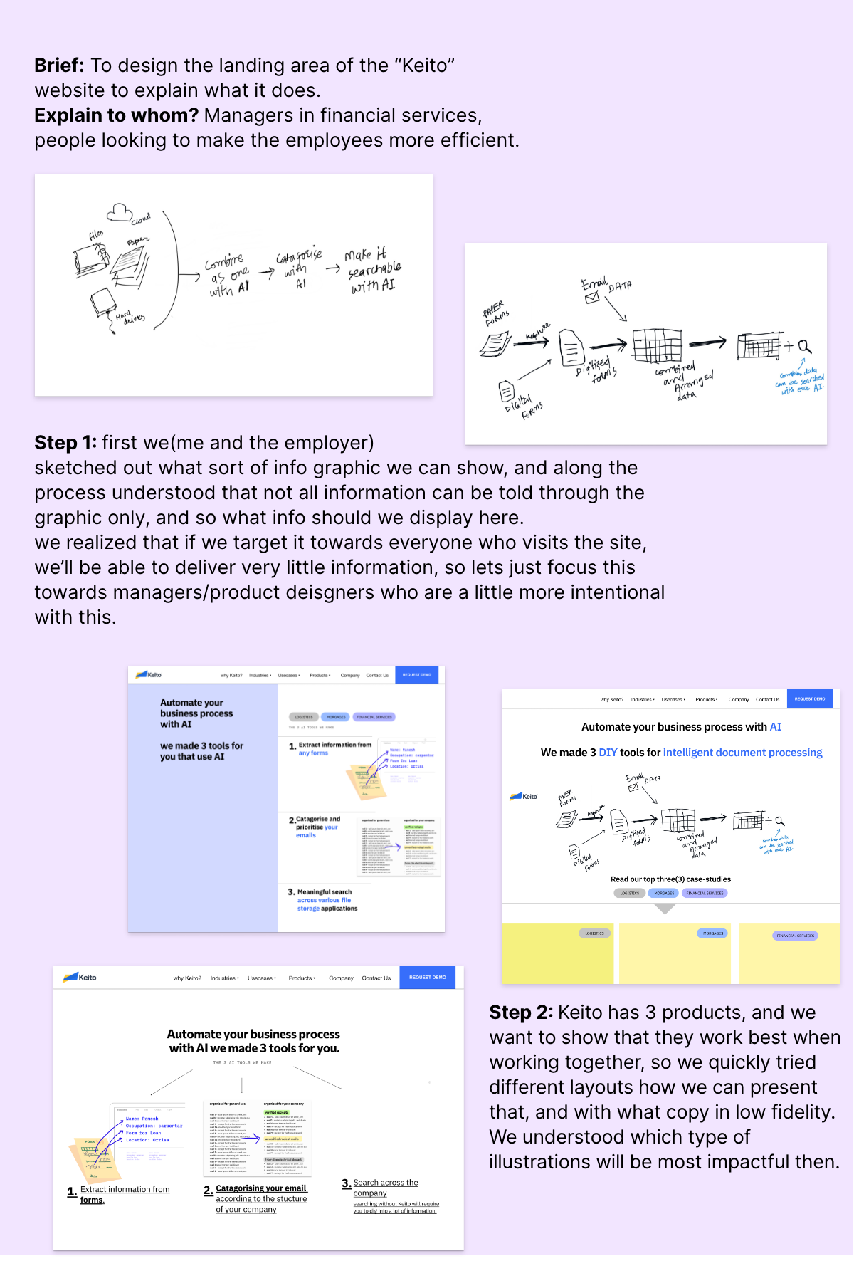
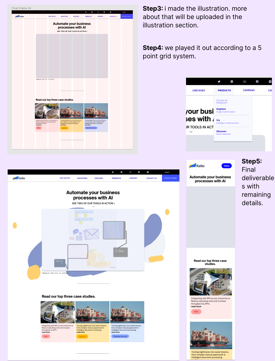
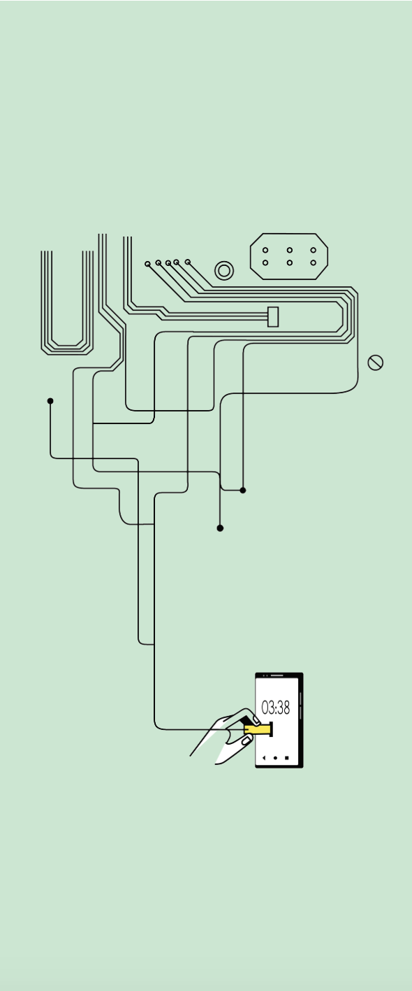
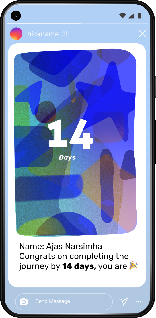
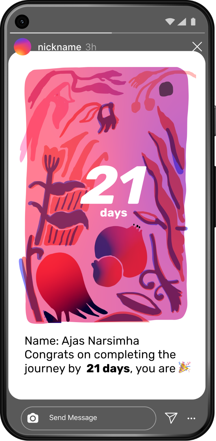
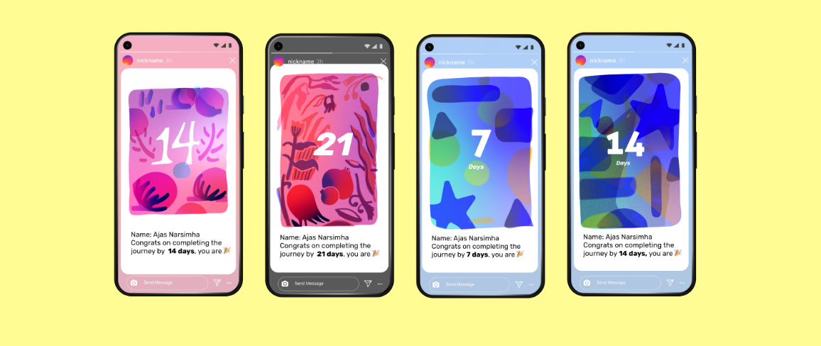
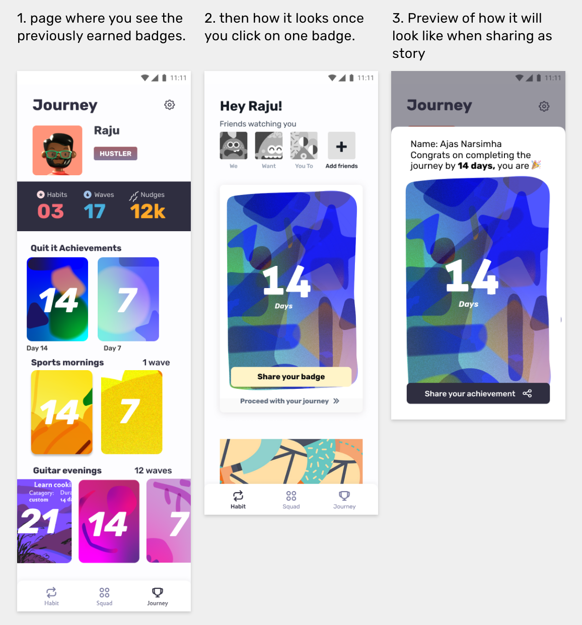
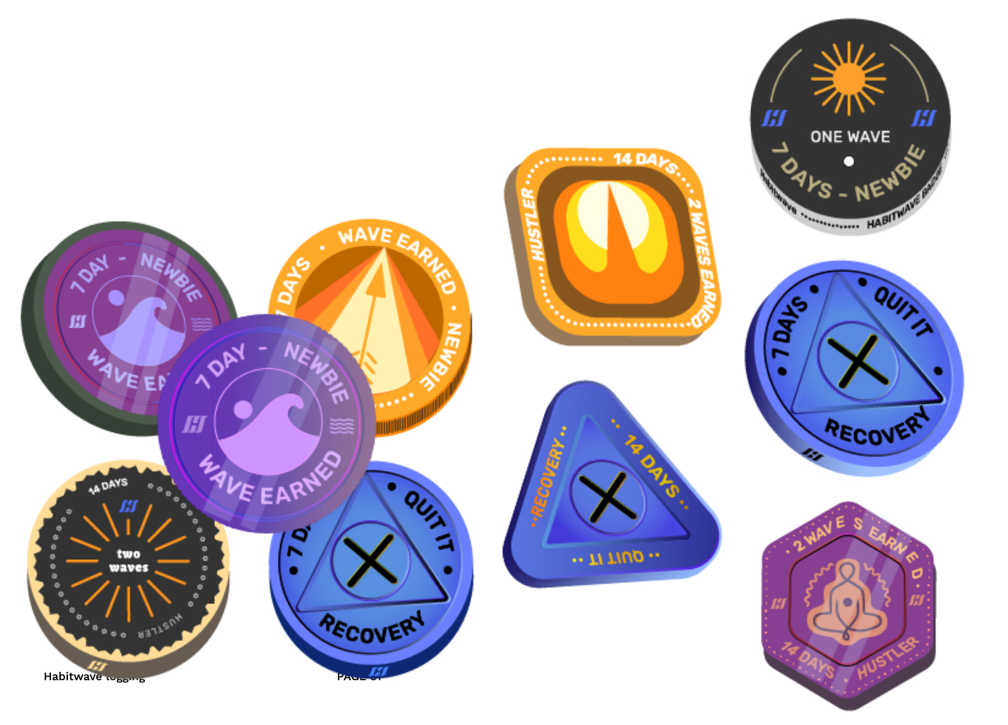
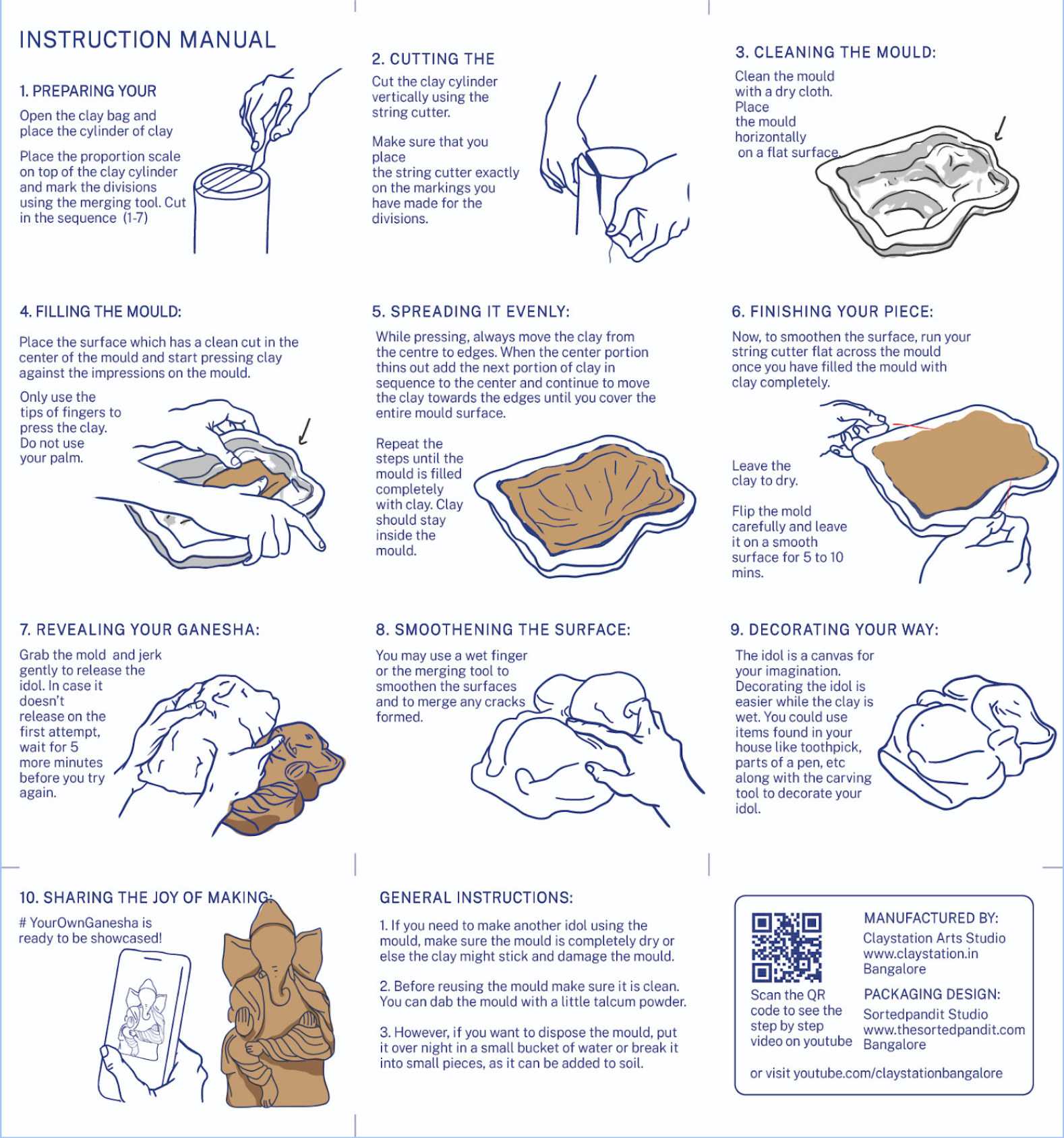
How will users interact with badges in Habitwave. (also created the badges)


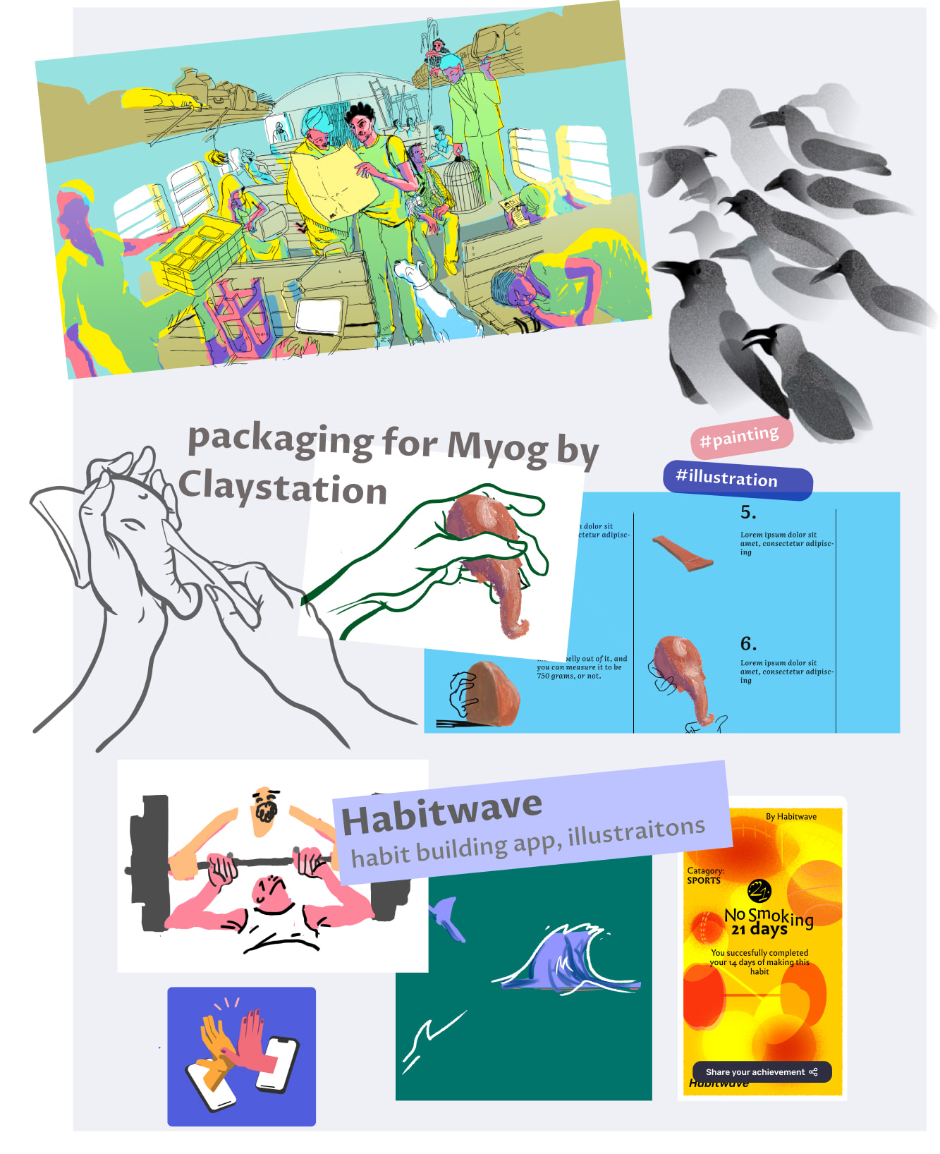
1. What are these images?
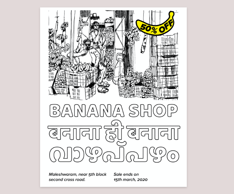
This is something user receives in the app when they achieve something can share on Instagram stories similar to the cult fit’s report. You get each of these at different milestones, (7, 14, 21, 28 days of building habit)
2. What is the app?
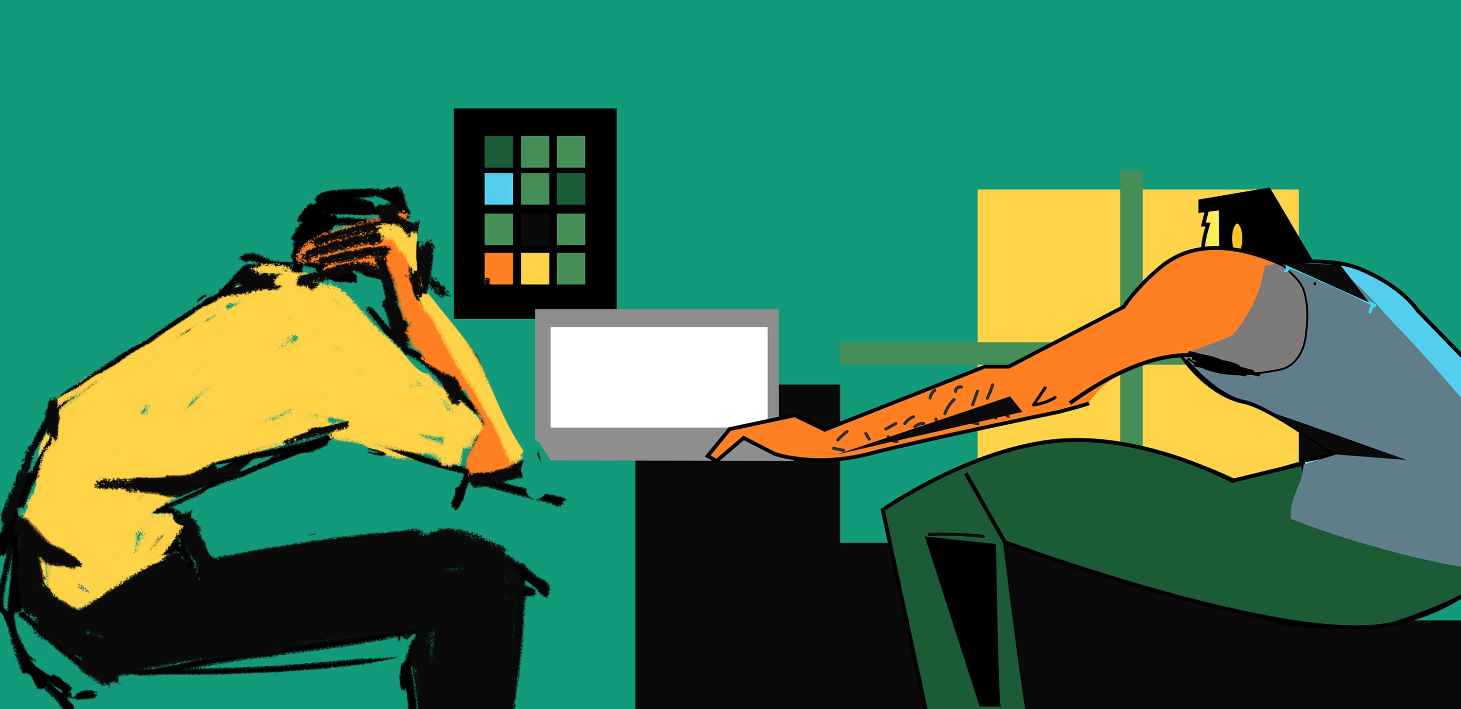
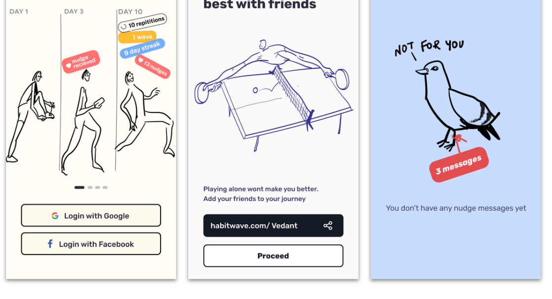
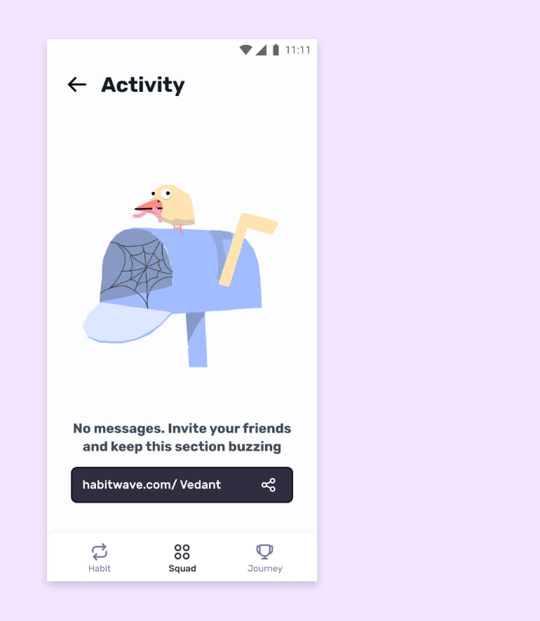
You and your friends track their habit using this app, and log every repetition in this app.
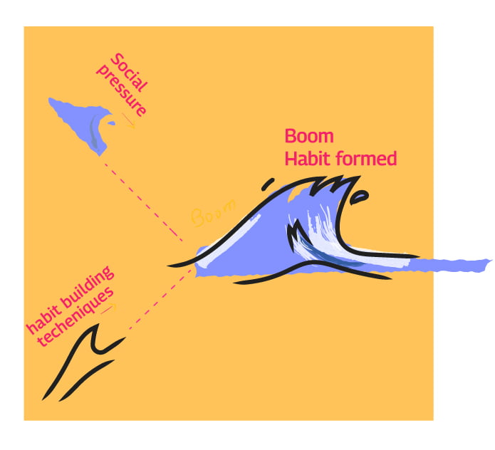
3. Why this app?
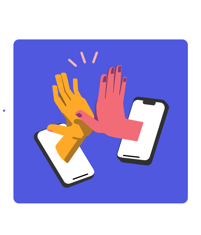
Making habits is hard when you do them alone, because there’s no accountability and peer pressure, here, Using this you can make them faster the social way.

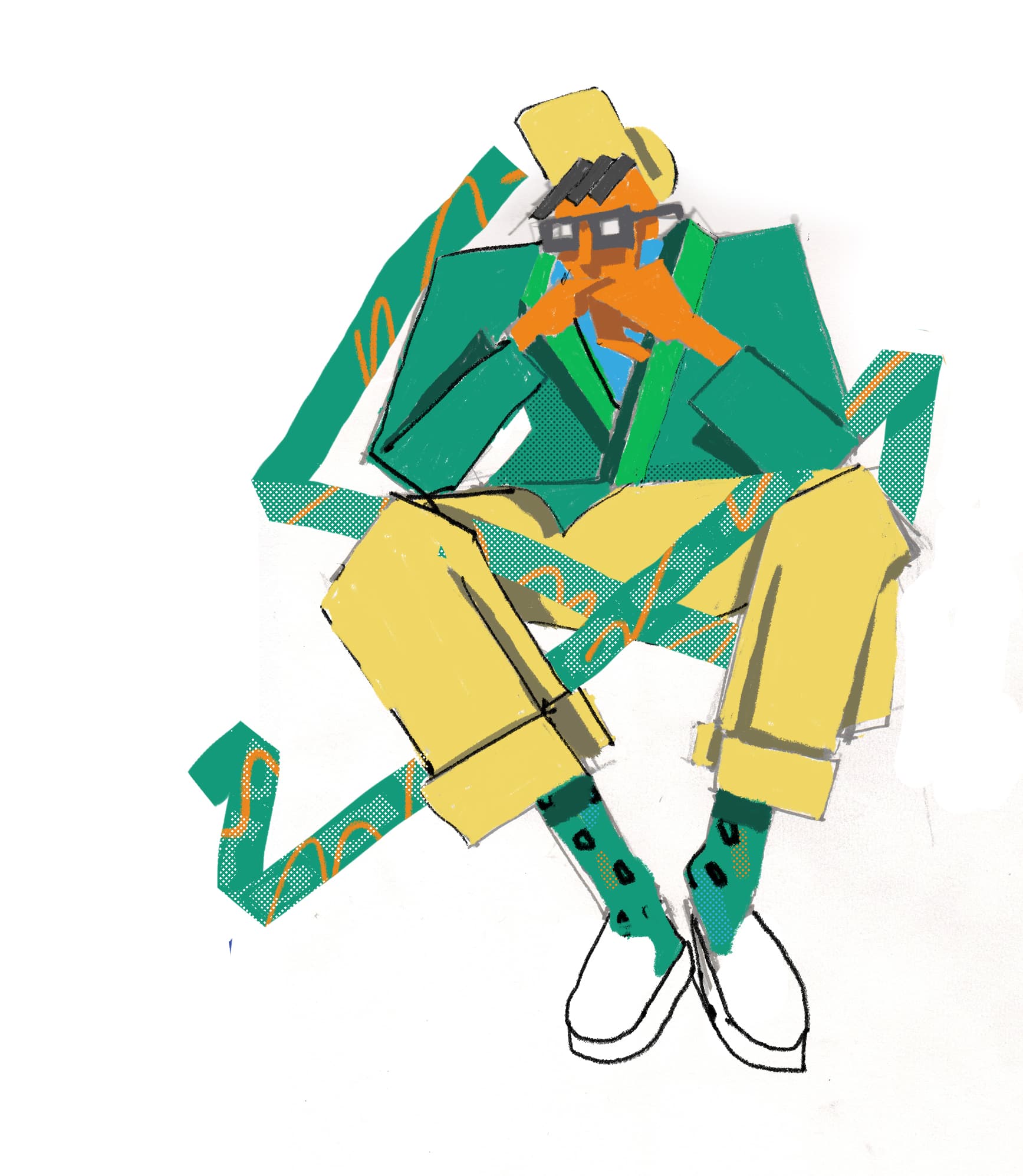
Different colors are for different category of habit.


4. Objective of these cards?
This is a new product and people are not aware of it, it is a luxury product. in the initial stages of the this marketing is very important. Challenge1: Make a consistent branding, and make it pretty. SVG.
Branded, because this is a crowded space, and we get users through social media sharing, now if the branding is distinct enough people will remember. and Pretty because this is a casual app, and we want the current users to share their achievements on the social media. Challenge 2: (more on next page) Suitable for app UI.
a. Figuring out the interaction with this card. b. How will they receive this, how will they be able to store the previous ones. c. how will they have their names when sharing instagram.


contd. to the next page.


Branding + UI Badges creation and intercation for showing for Habitwave.


Challenge 2: Suitable for app UI. a. Figuring out the interaction with this card. b. How will they receive this, how will they be able to store the previous ones. c. how will they have their names when sharing instagram.

UI design: Habitwave team


1. Ok so what’s unique about this style is: Visually it looks like made from brush strokes And it must tell a Meta story.


2. Ok so what’s unique about this style is: Visually it looks like made from brush strokes And it must tell a Meta story.

4. Rubik style with rounded edges

3. what’s unique about this style is:
i) Visually it looks like made from brush strokes
ii) And it must tell a Meta story.


Trying different styles to find the one that matches the voice

What are we doing here?
we are coming up with the voice of the app, and what kind of illustration style matches that voice the best.


More illustrations in the chosen style


Claystation - Identity Design Through Illustrations and Packaging


Craft Work

Watercolor Paintings

Thumbnail illustration for the blog “key takeaways from Google i/o’19”


Header image for the Product updates blog and emailer.

Drawings from Instagram

First one.This is an old shop in Bangalore that just sold bananas, i had not seen anything like this before. One of the person’s I was getting my portfolio reviewed from told me to turn these things into a mockup and so here it is.


Second one is again just a sketch of the time i had just come to Bangalore.


Drawings from Instagram

Three of these drawings were created in order to create the colorful Indian fashion of everyday people. Another one of the drawings is of the cooler we use back in Rajasthan.


Explore other pages:
about me
index